We Mean Green
Campaign
2021
SCOPE
Creative Direction and Campaign
Visual Identity Systems
Verbal Identity and Messaging
Art Direction
Digital Art Direction
Toggle
BRIEF
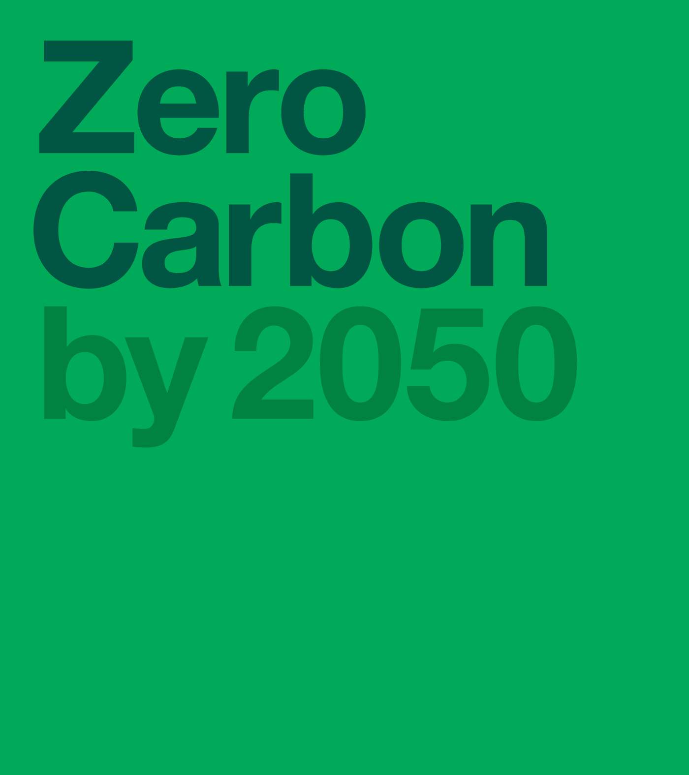
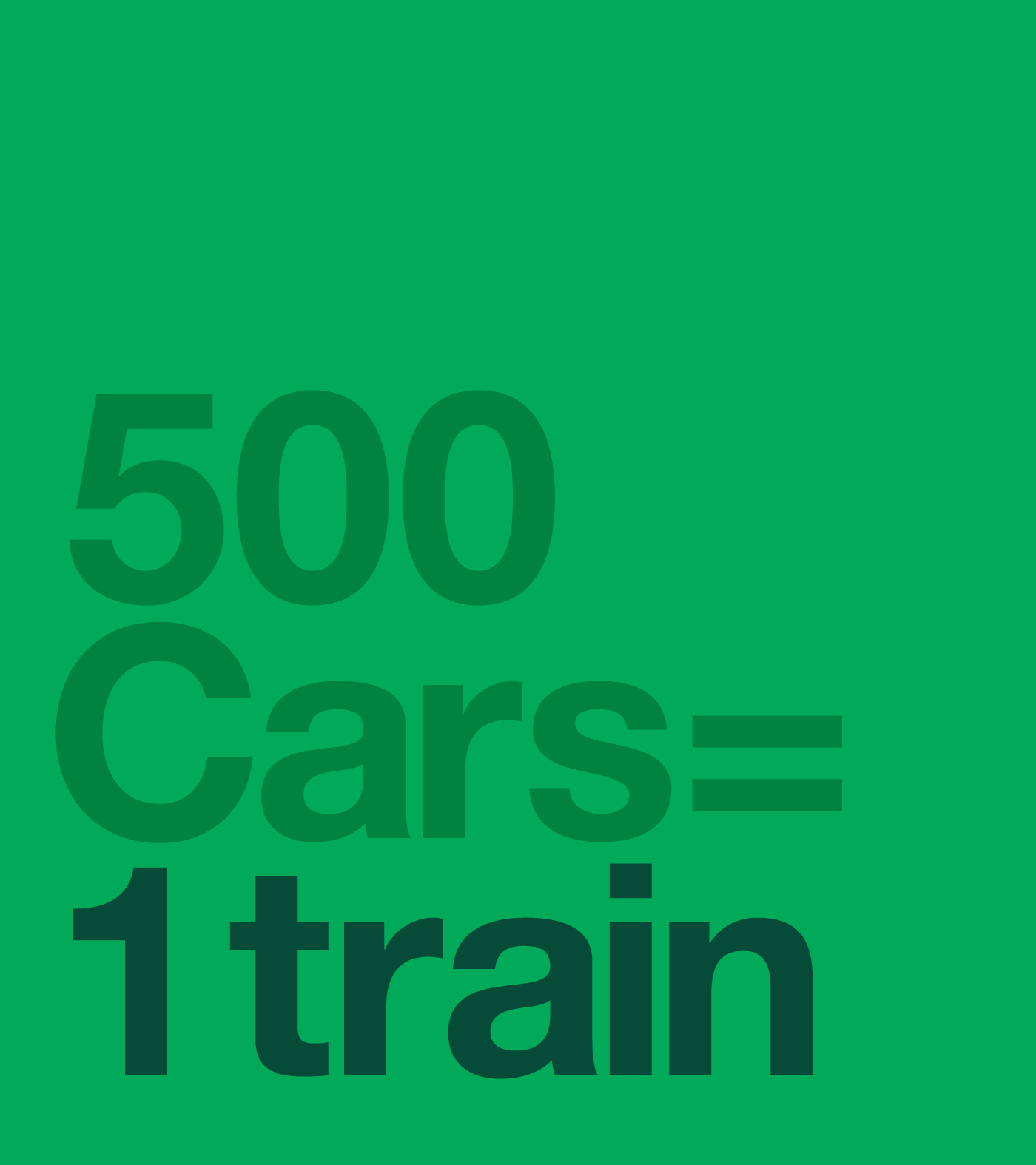
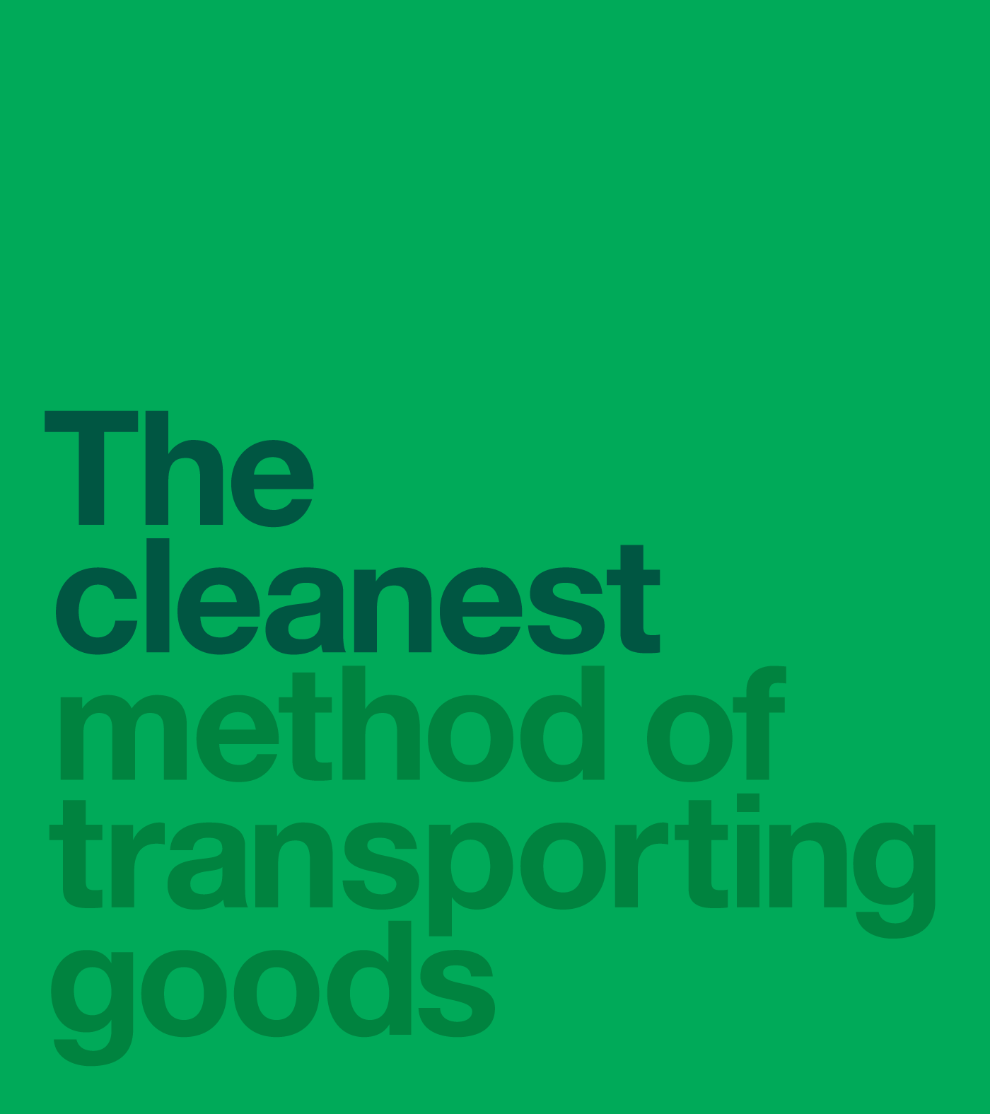
Rail is the backbone of a green economy. For COP26, we were asked to create a high-impact campaign to encourage a “modal shift” from road to rail. The goal was to communicate the environmental superiority of trains in a way that felt both urgent and authoritative to a global audience.
WORK
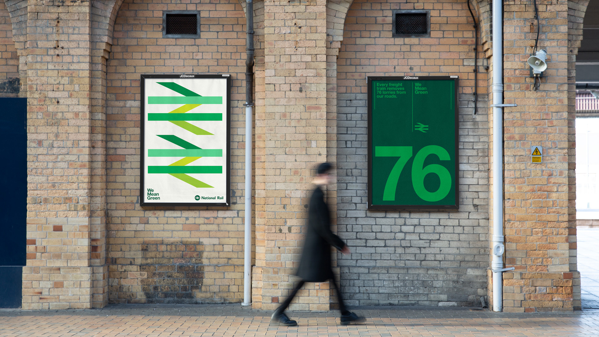
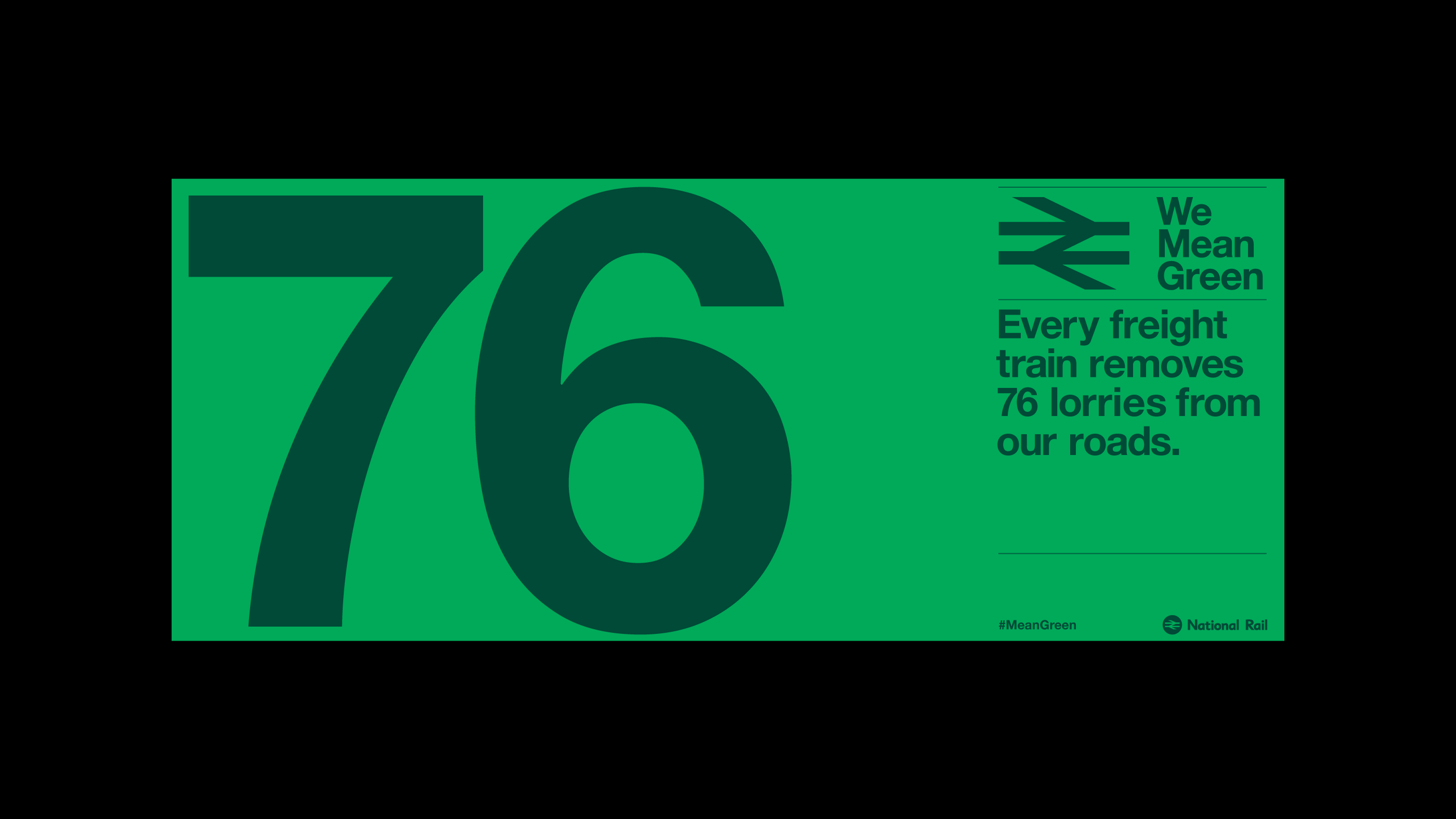
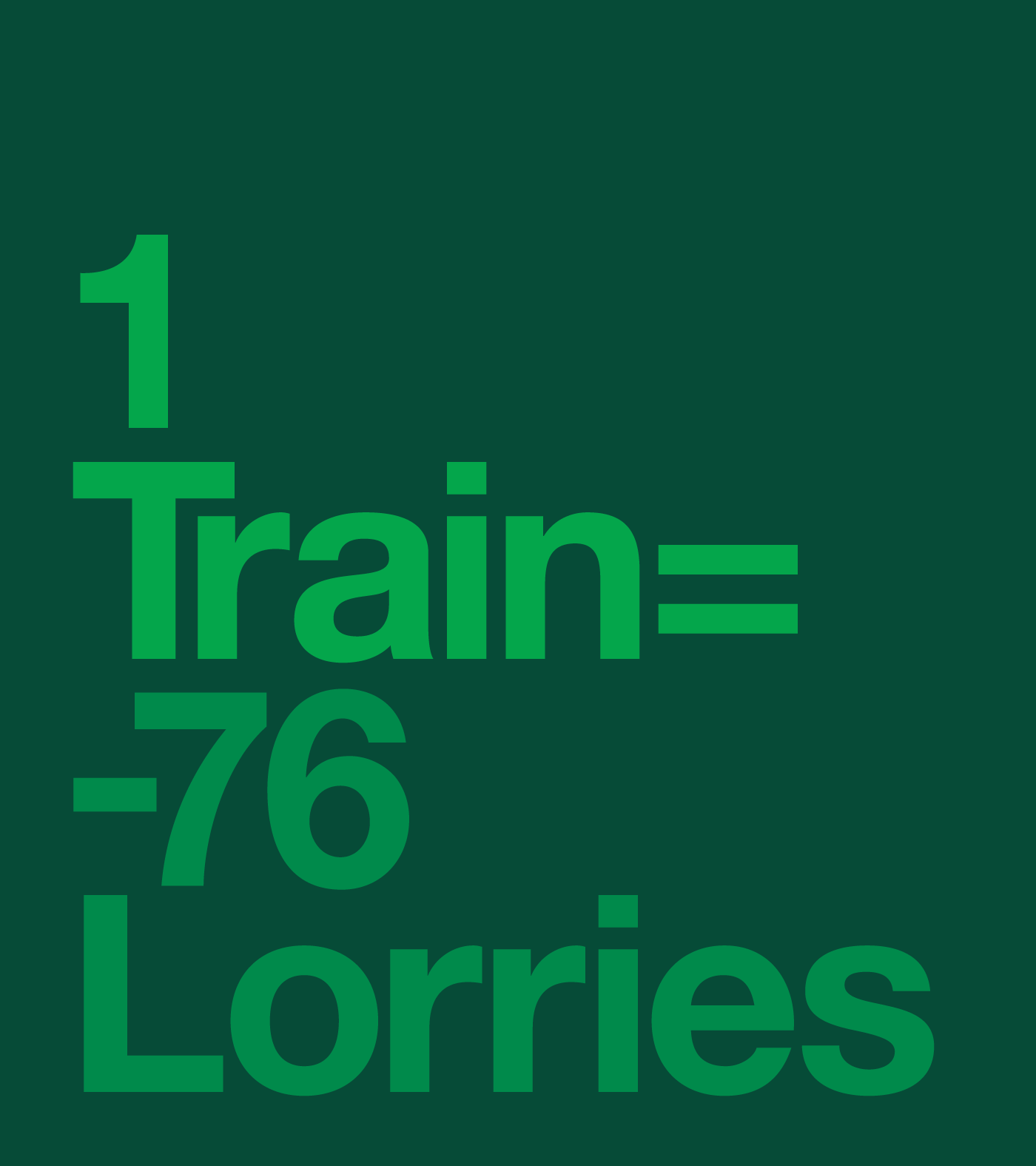
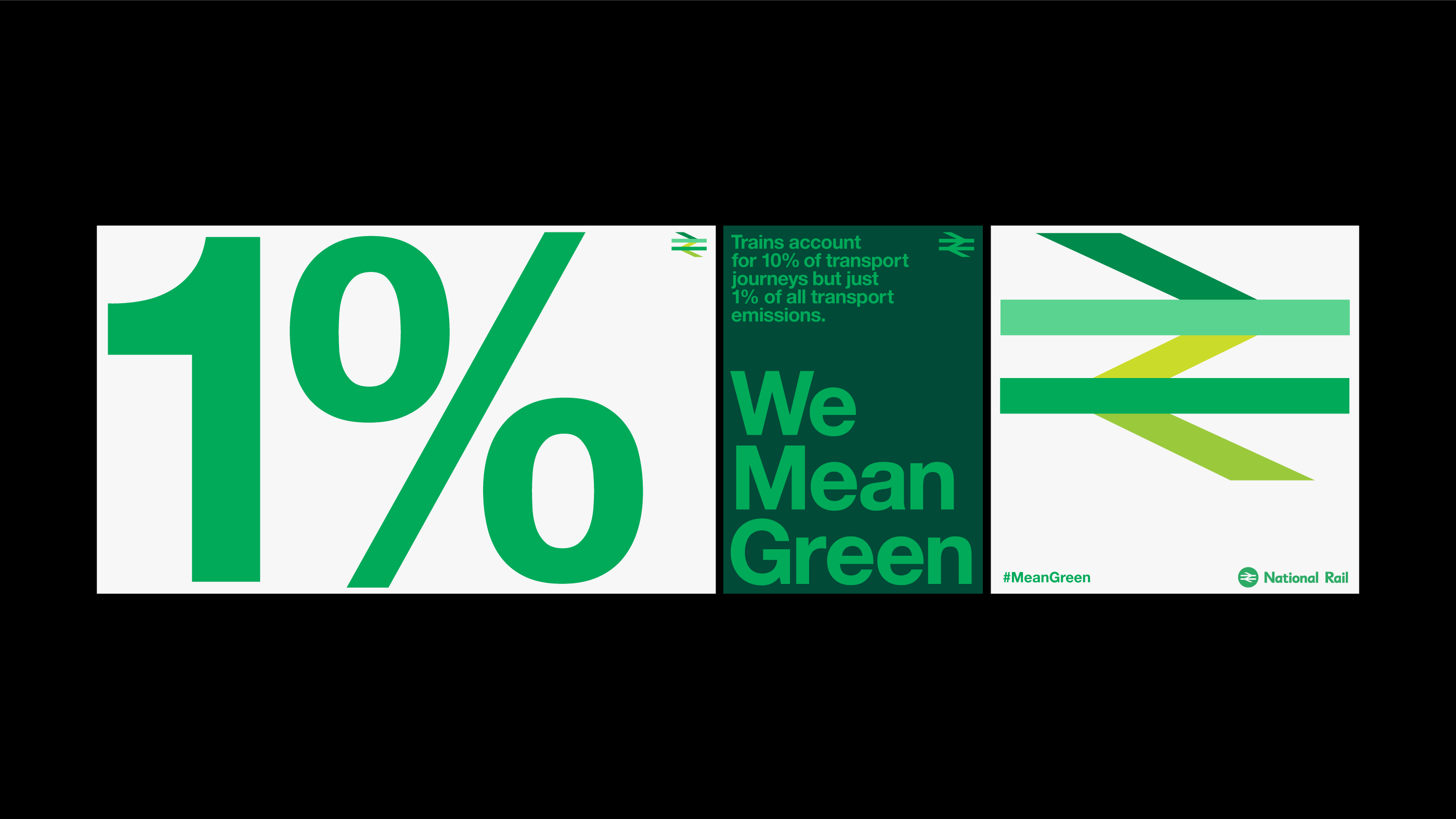
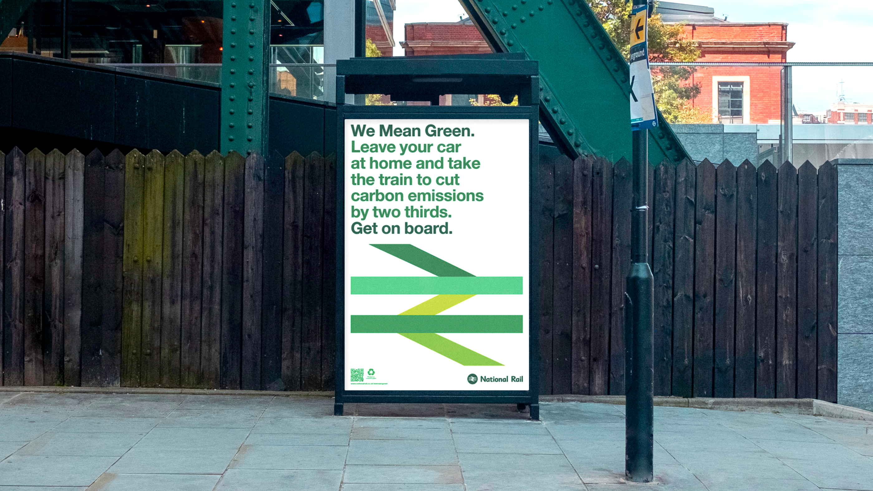
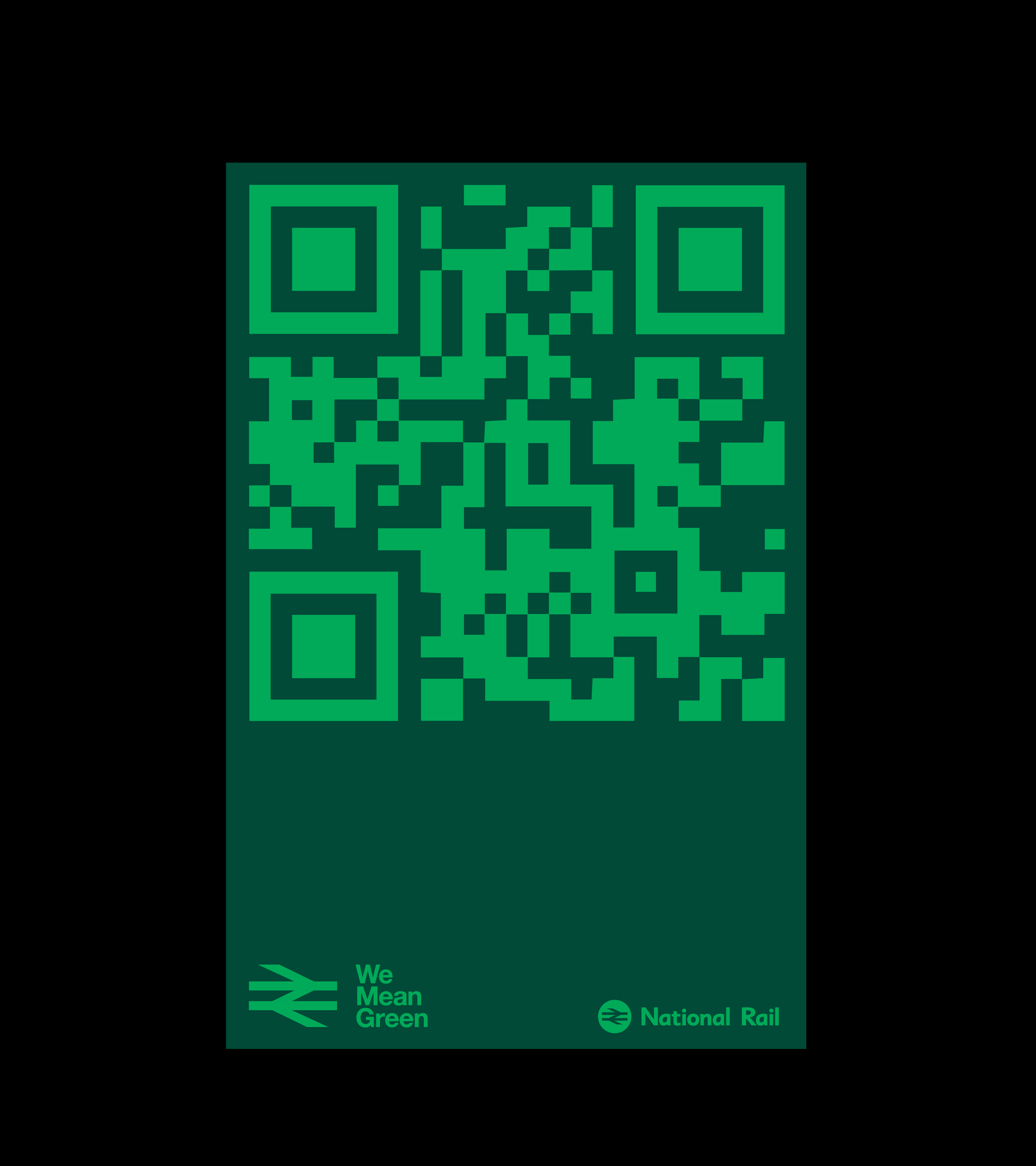
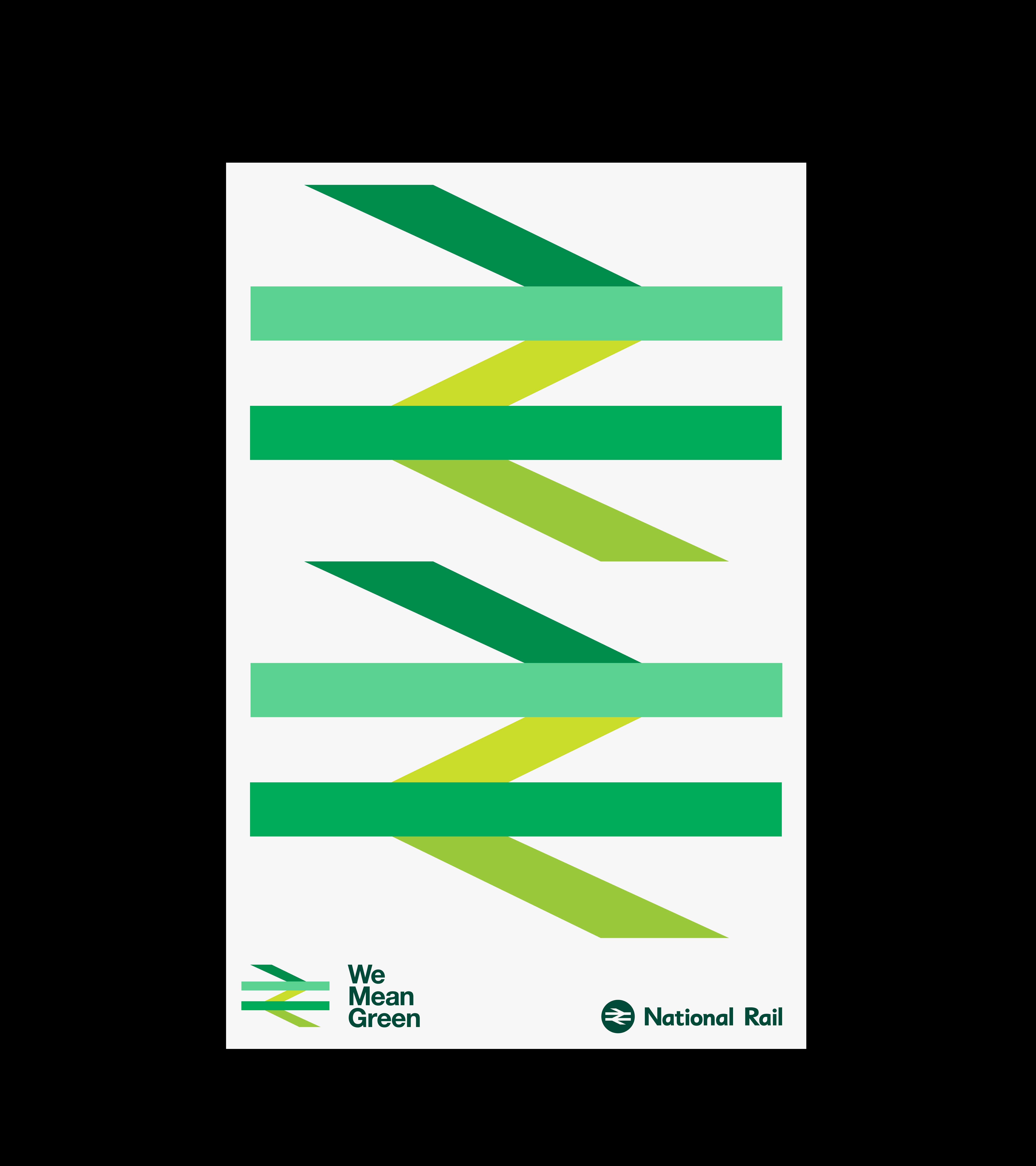
We leveraged one of the most recognisable symbols in British design history. By using a colour adaptation of the “Britain Runs on Rail” logotype, which was originally derived from Gerald Barney’s 1965 double-arrow, we grounded the campaign in heritage. This strategic move allowed us to tap into public trust while pivoting the conversation toward the future of net-zero transport.
PLAY
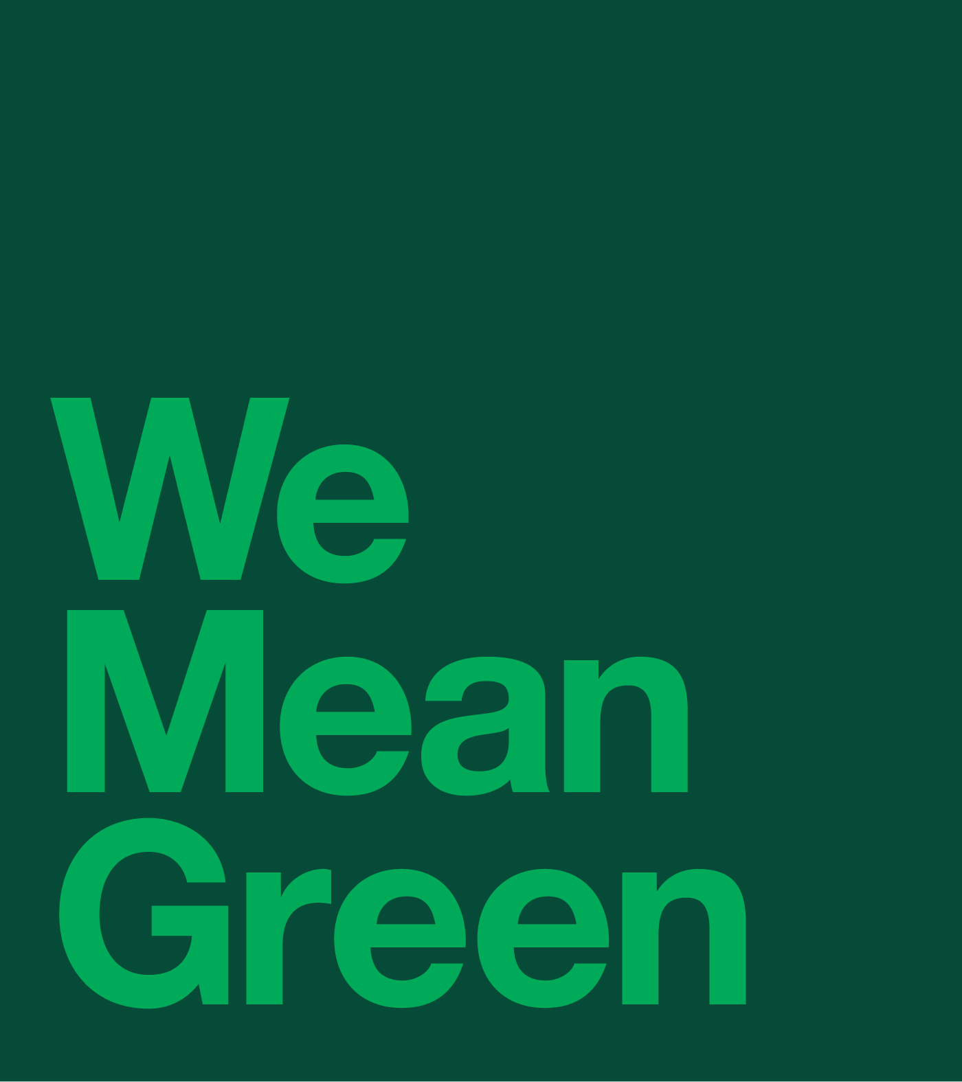
The “We Mean Green” campaign is a masterclass in using colour to shift perspective. By reimagining a design icon, we turned a familiar shape into a bold environmental statement across print and digital platforms. Over eight weeks, the campaign moved beyond mere promotion to become a visual anchor for the rail industry’s commitment to a sustainable planet.
Toggle
We Mean Green
- Creative Direction and Campaign
- Visual Identity Systems
- Verbal Identity and Messaging
- Art Direction
- Digital Art Direction
BRIEF
Rail is the backbone of a green economy. For COP26, we were asked to create a high-impact campaign to encourage a “modal shift” from road to rail. The goal was to communicate the environmental superiority of trains in a way that felt both urgent and authoritative to a global audience.
WORK
We leveraged one of the most recognisable symbols in British design history. By using a colour adaptation of the “Britain Runs on Rail” logotype, which was originally derived from Gerald Barney’s 1965 double-arrow, we grounded the campaign in heritage. This strategic move allowed us to tap into public trust while pivoting the conversation toward the future of net-zero transport.
PLAY
The “We Mean Green” campaign is a masterclass in using colour to shift perspective. By reimagining a design icon, we turned a familiar shape into a bold environmental statement across print and digital platforms. Over eight weeks, the campaign moved beyond mere promotion to become a visual anchor for the rail industry’s commitment to a sustainable planet.