


SCOPE
Visual Identity Systems
Illustration and Art Direction
Environmental and Signage
Digital Art Direction
Editorial and Print Design
Verbal Identity and Messaging
Toggle
BRIEF
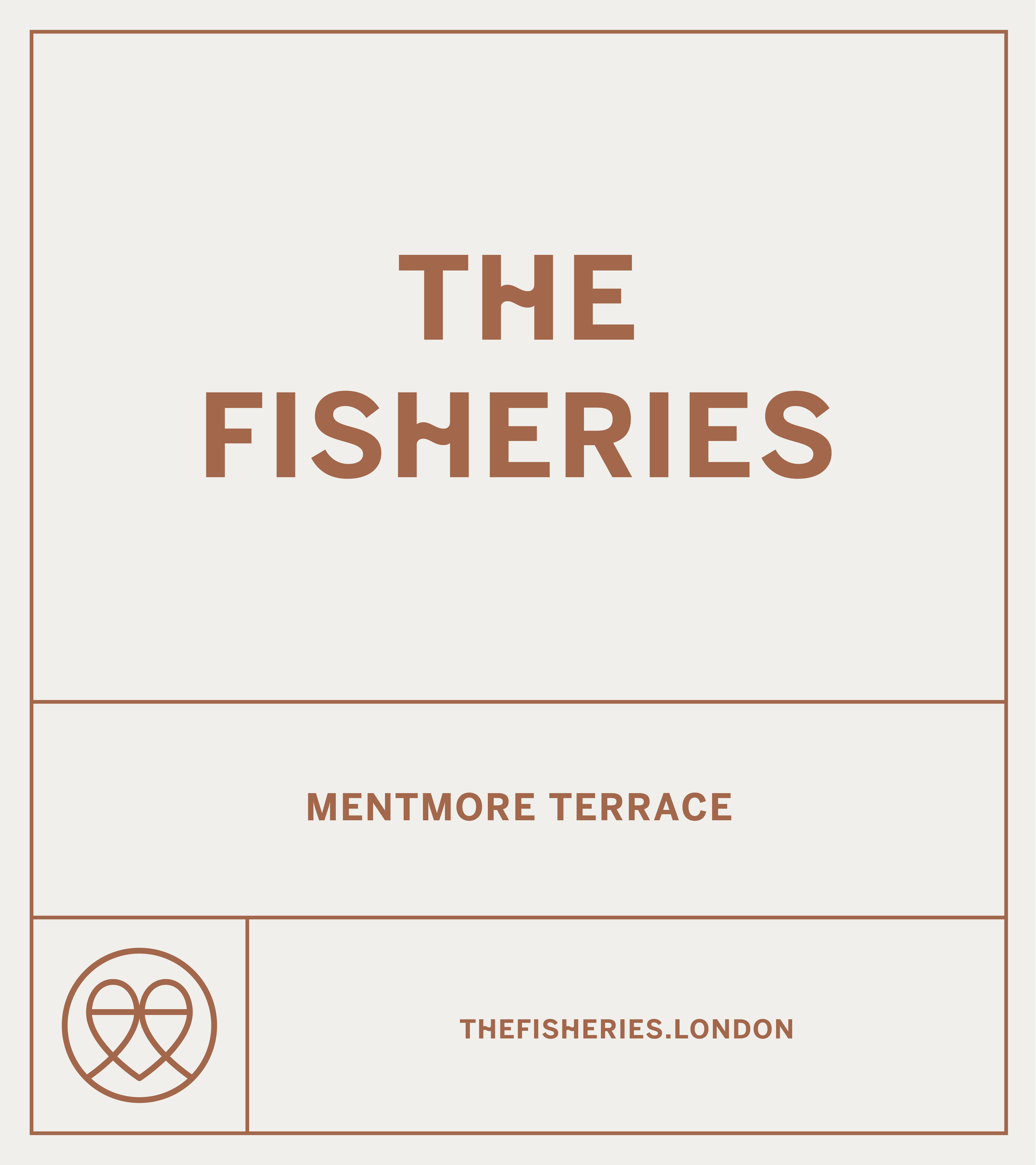
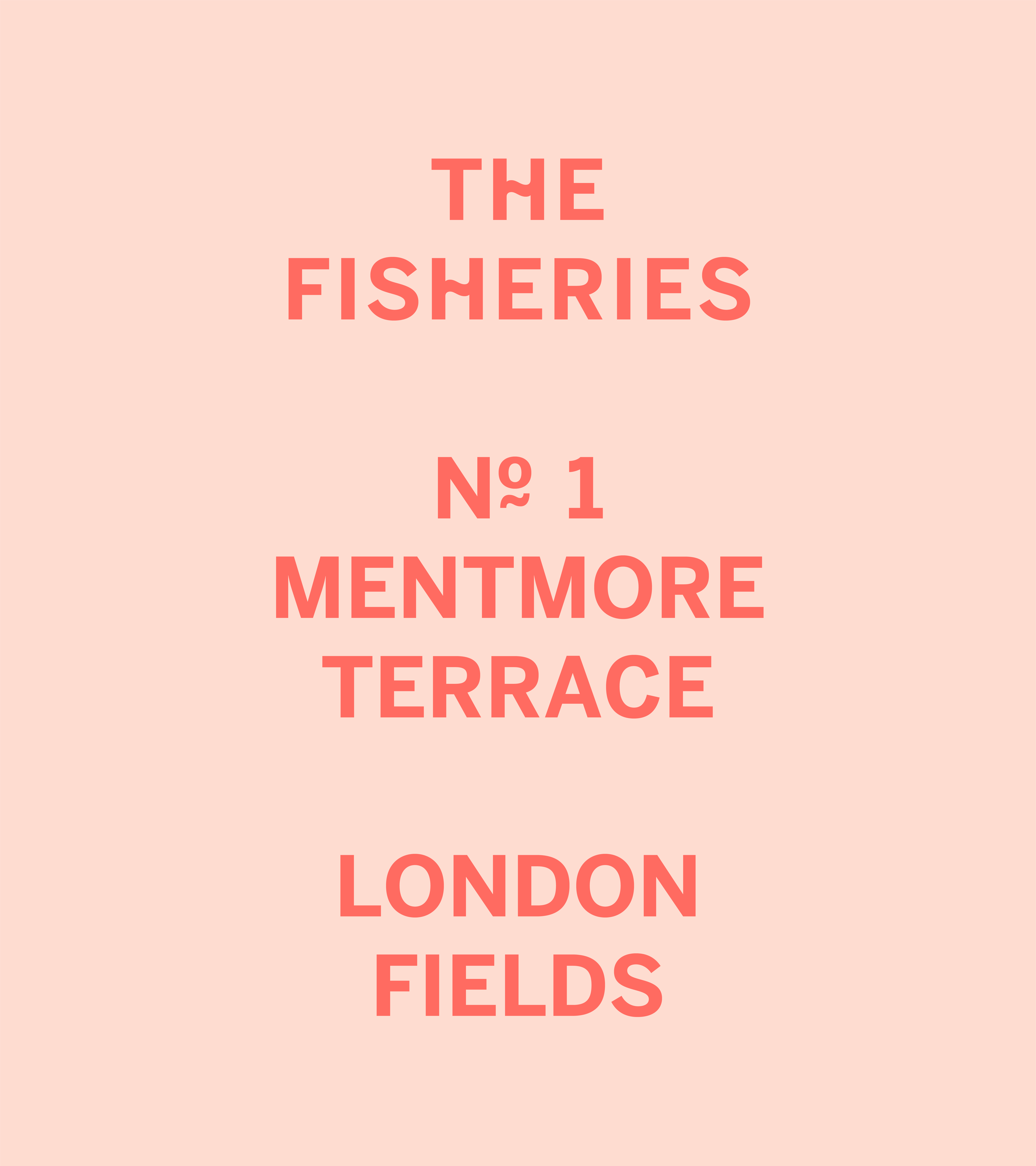
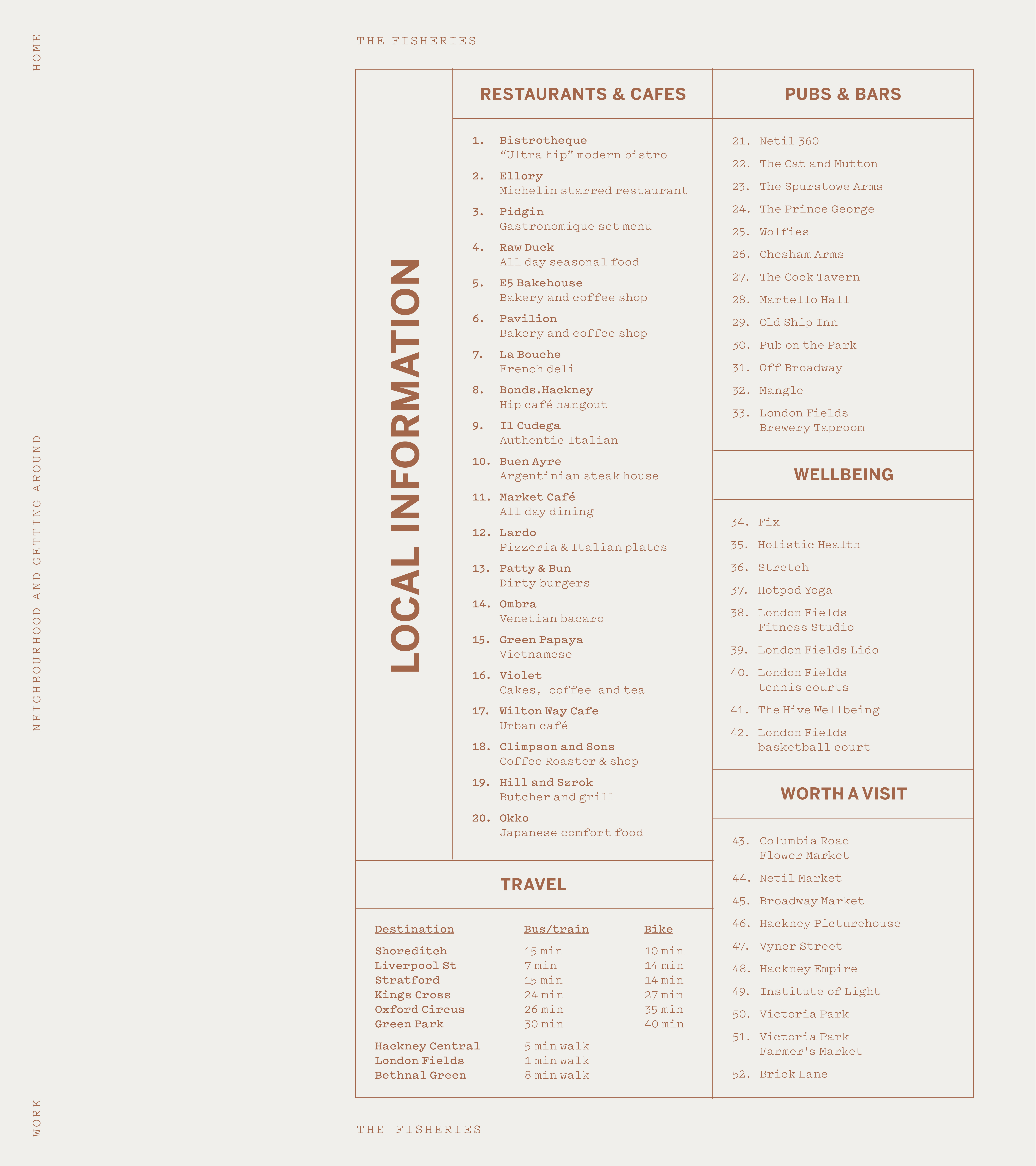
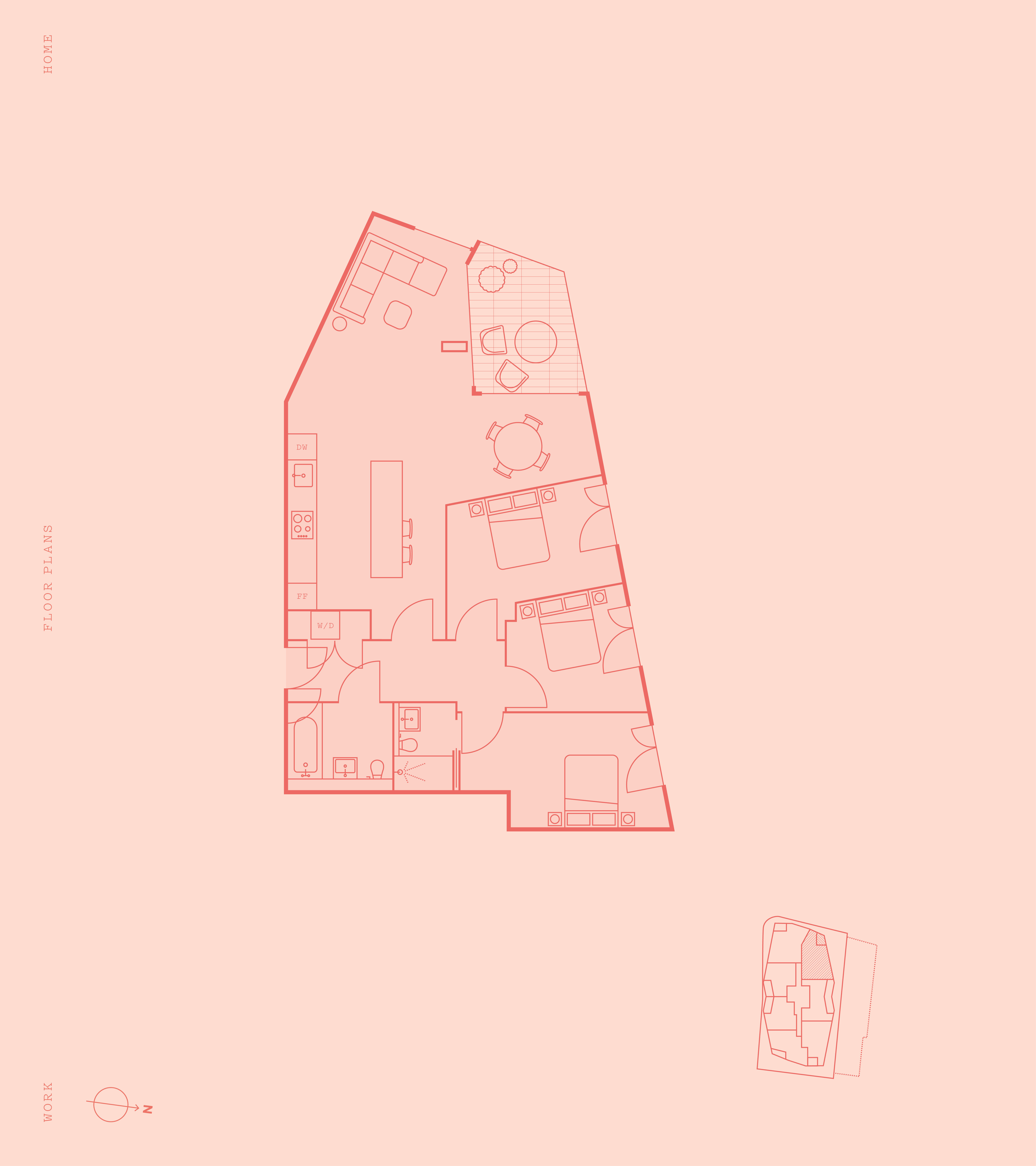
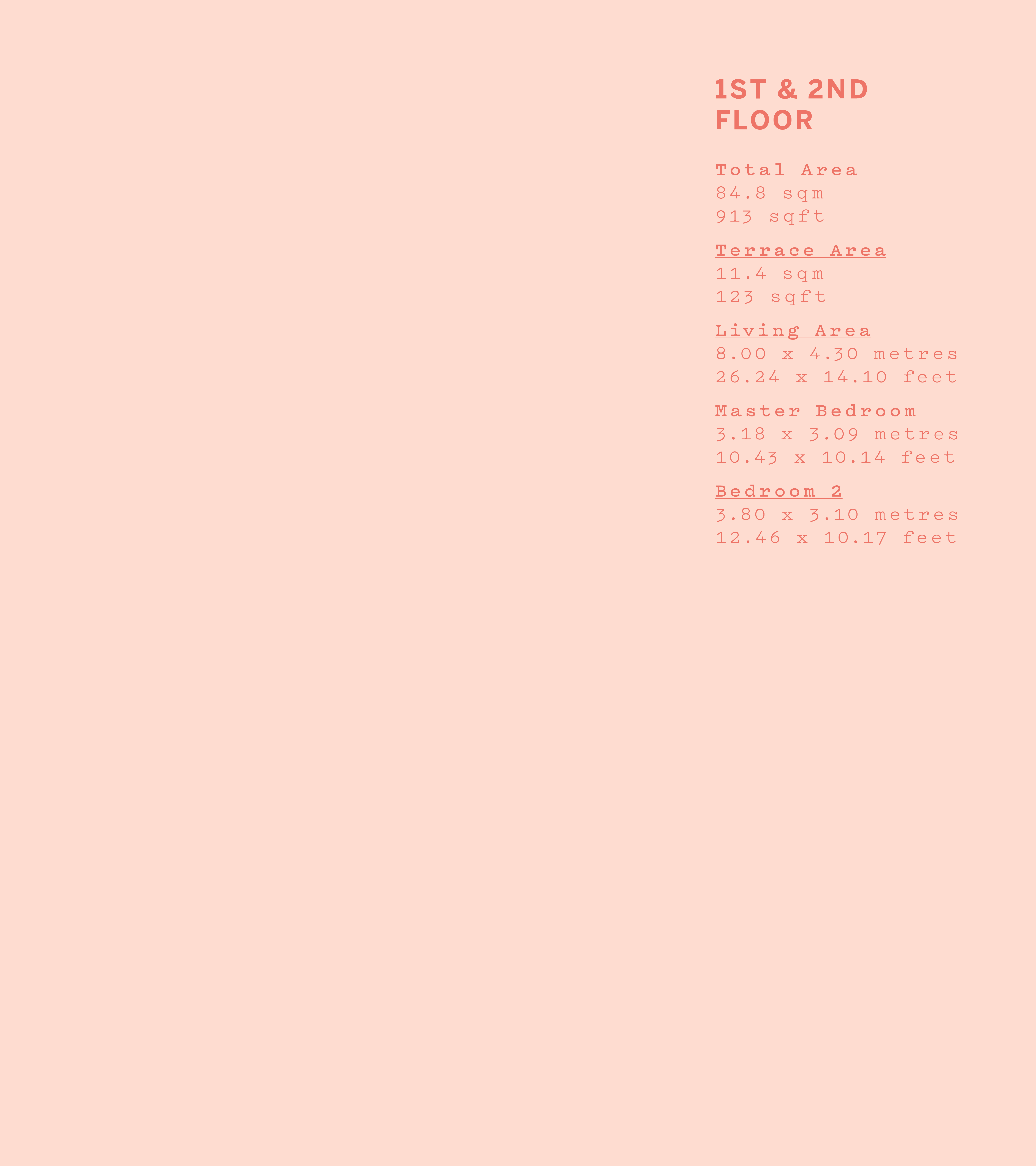
The Fisheries is a live-work development located in the heart of London Fields. It combines 31 warehouse-style apartments with a commercial hub for creative entrepreneurs. We were tasked with creating an identity that respects the building’s industrial heritage while appealing to a modern, design-conscious audience looking for a place to both live and create.
WORK
We wanted the brand to feel rooted in the physical architecture of the site. This required a benchmark of clarity across a diverse suite of touchpoints—from large-scale site hoarding to a high-end property brochure. Our strategy was to move beyond standard real estate marketing, instead positioning The Fisheries as a vibrant community anchor that celebrates both its history and its contemporary purpose.
PLAY
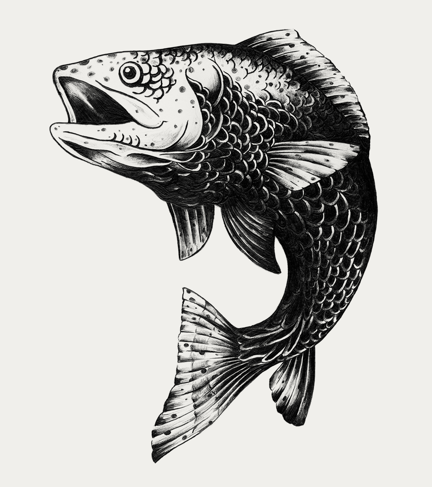
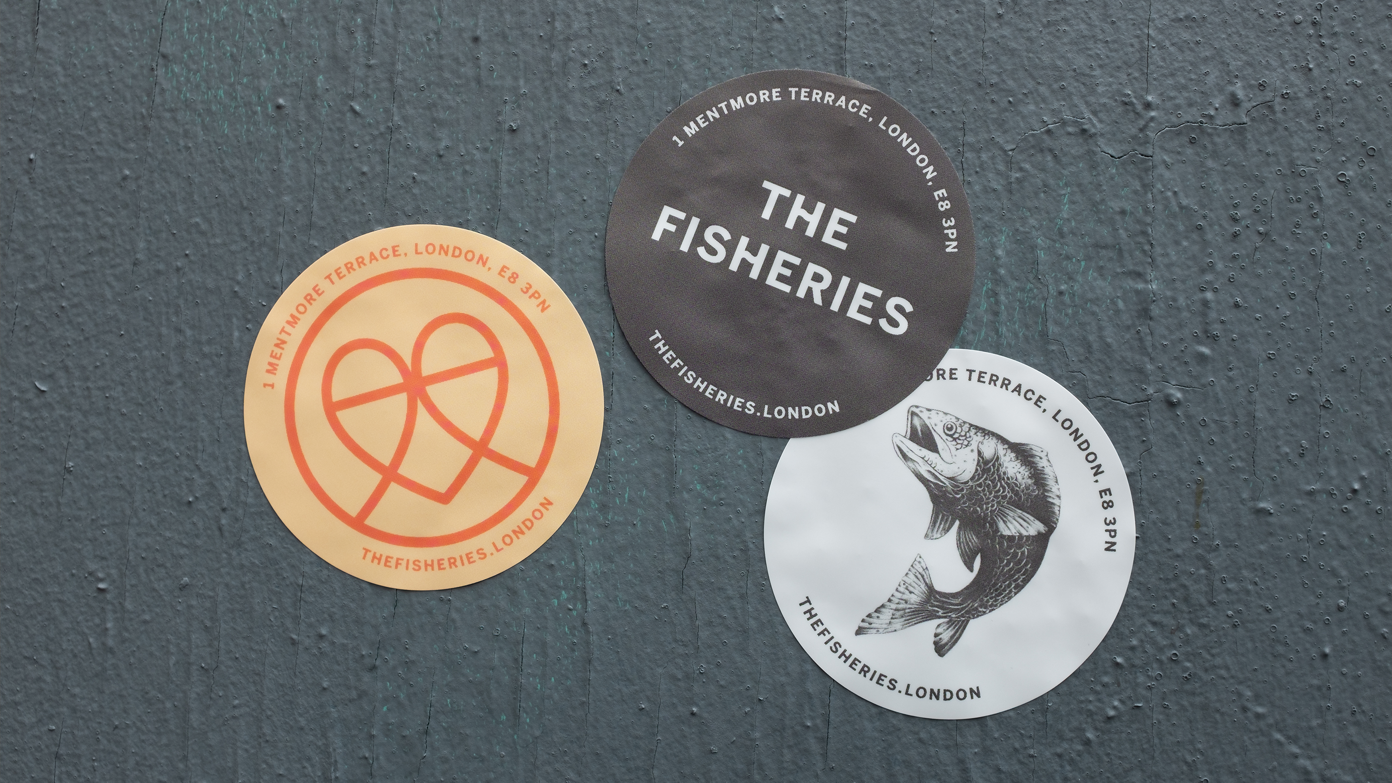
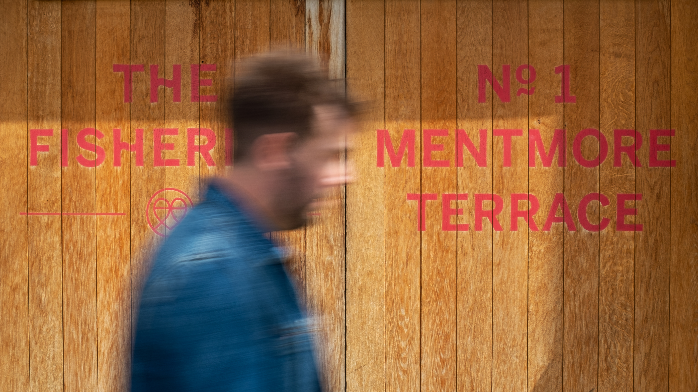
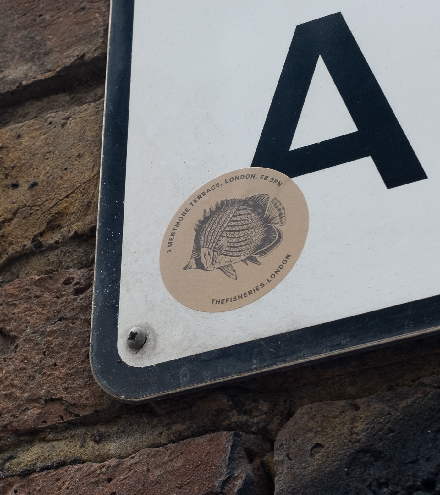
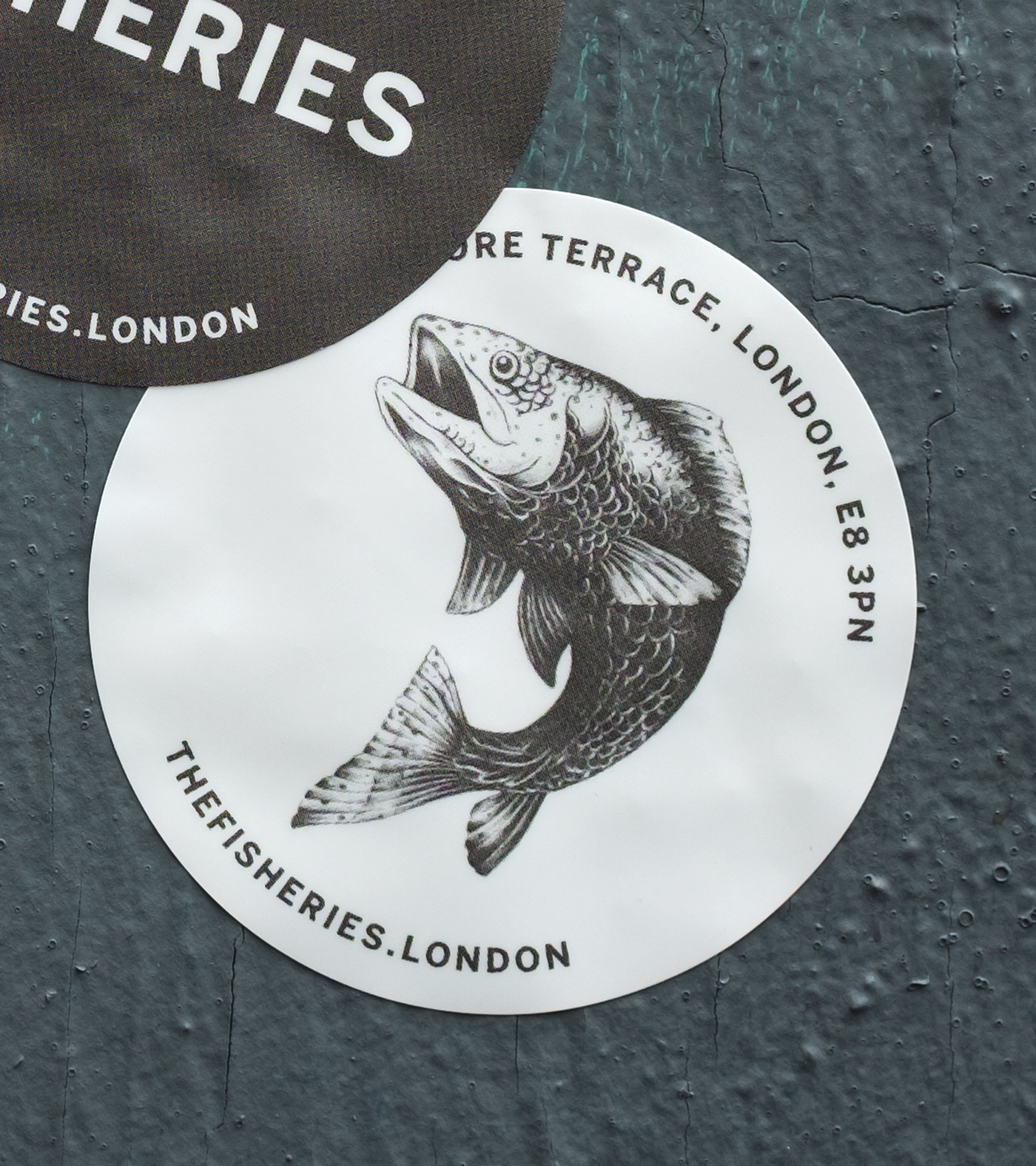
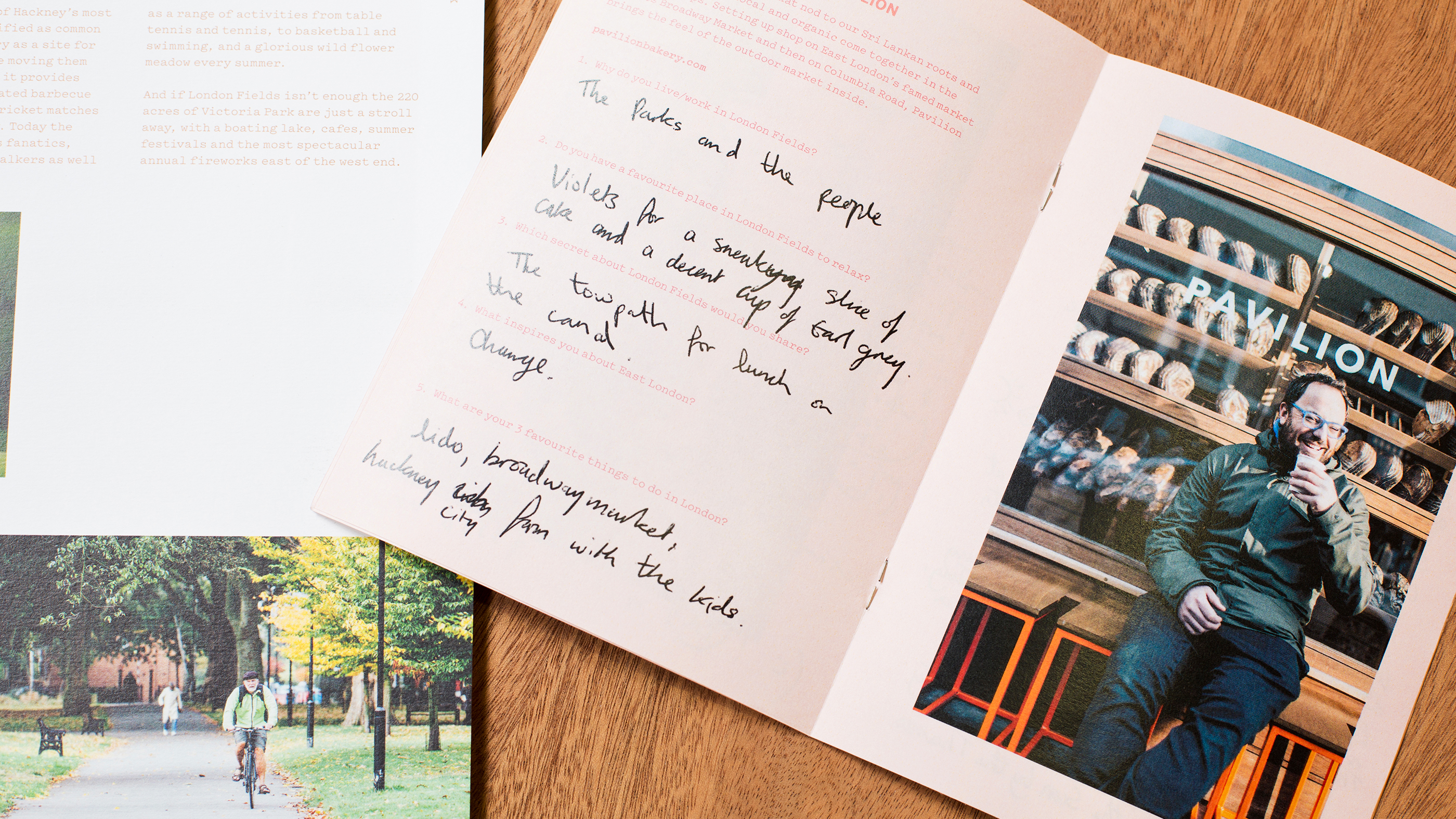
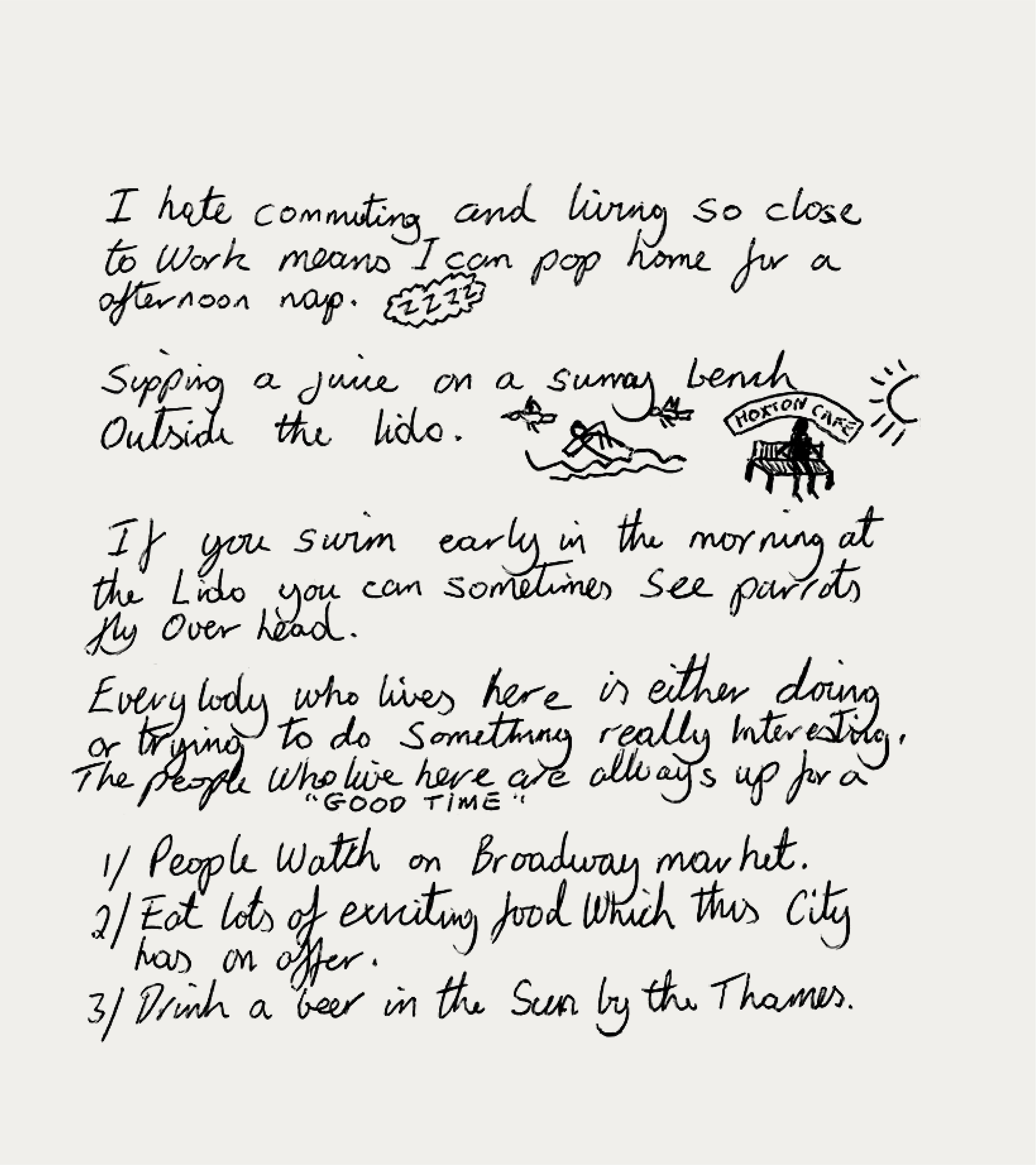
Our approach adapted an existing font and introducing a series of bespoke fish illustrations, a literal yet stylish nod to the name. We curated a mix of original photography and Studio Blackburn illustrations to showcase not just the building, but the soul of the surrounding neighborhood. The final suite included signage, a website, and hoarding that turned a construction site into a local landmark before the doors even opened.
Toggle
The Fisheries
- Visual Identity Systems
- Illustration and Art Direction
- Environmental and Signage
- Digital Art Direction
- Editorial and Print Design
- Verbal Identity and Messaging
BRIEF
The Fisheries is a live-work development located in the heart of London Fields. It combines 31 warehouse-style apartments with a commercial hub for creative entrepreneurs. We were tasked with creating an identity that respects the building’s industrial heritage while appealing to a modern, design-conscious audience looking for a place to both live and create.
WORK
We wanted the brand to feel rooted in the physical architecture of the site. This required a benchmark of clarity across a diverse suite of touchpoints—from large-scale site hoarding to a high-end property brochure. Our strategy was to move beyond standard real estate marketing, instead positioning The Fisheries as a vibrant community anchor that celebrates both its history and its contemporary purpose.
PLAY
Our approach adapted an existing font and introducing a series of bespoke fish illustrations, a literal yet stylish nod to the name. We curated a mix of original photography and Studio Blackburn illustrations to showcase not just the building, but the soul of the surrounding neighborhood. The final suite included signage, a website, and hoarding that turned a construction site into a local landmark before the doors even opened.