
Nopinz
Brand Refresh
2025
SCOPE
Brand Strategy and Positioning
Core Visual Identity System
Verbal Identity
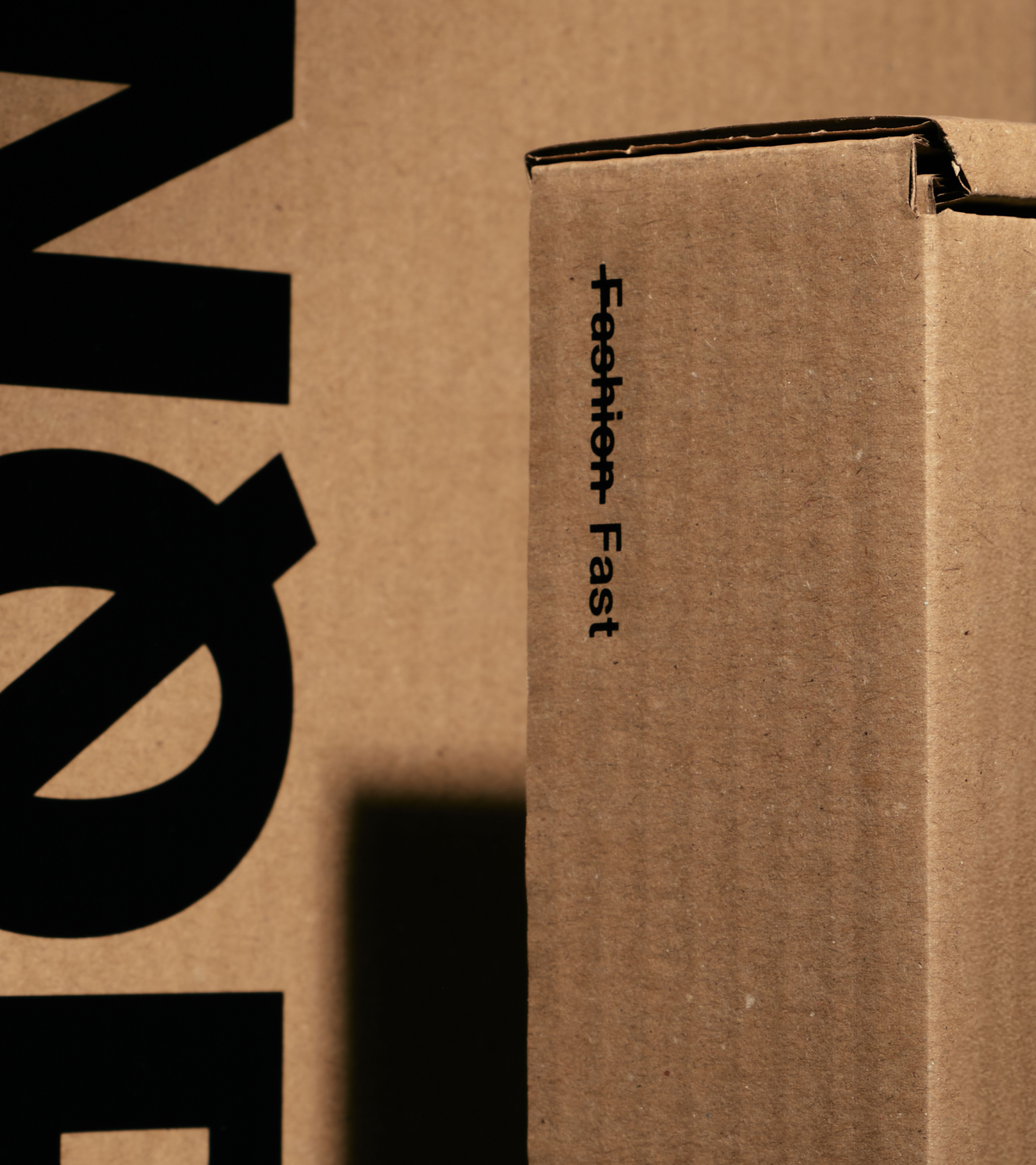
Packaging Systems
Art Direction
Toggle
BRIEF
Nopinz is for competitive athletes who care about one thing: performance. We needed to differentiate them from the “fashion-first” cycling brands and reinforce their status as the go-to for pure, unadulterated speed.
WORK
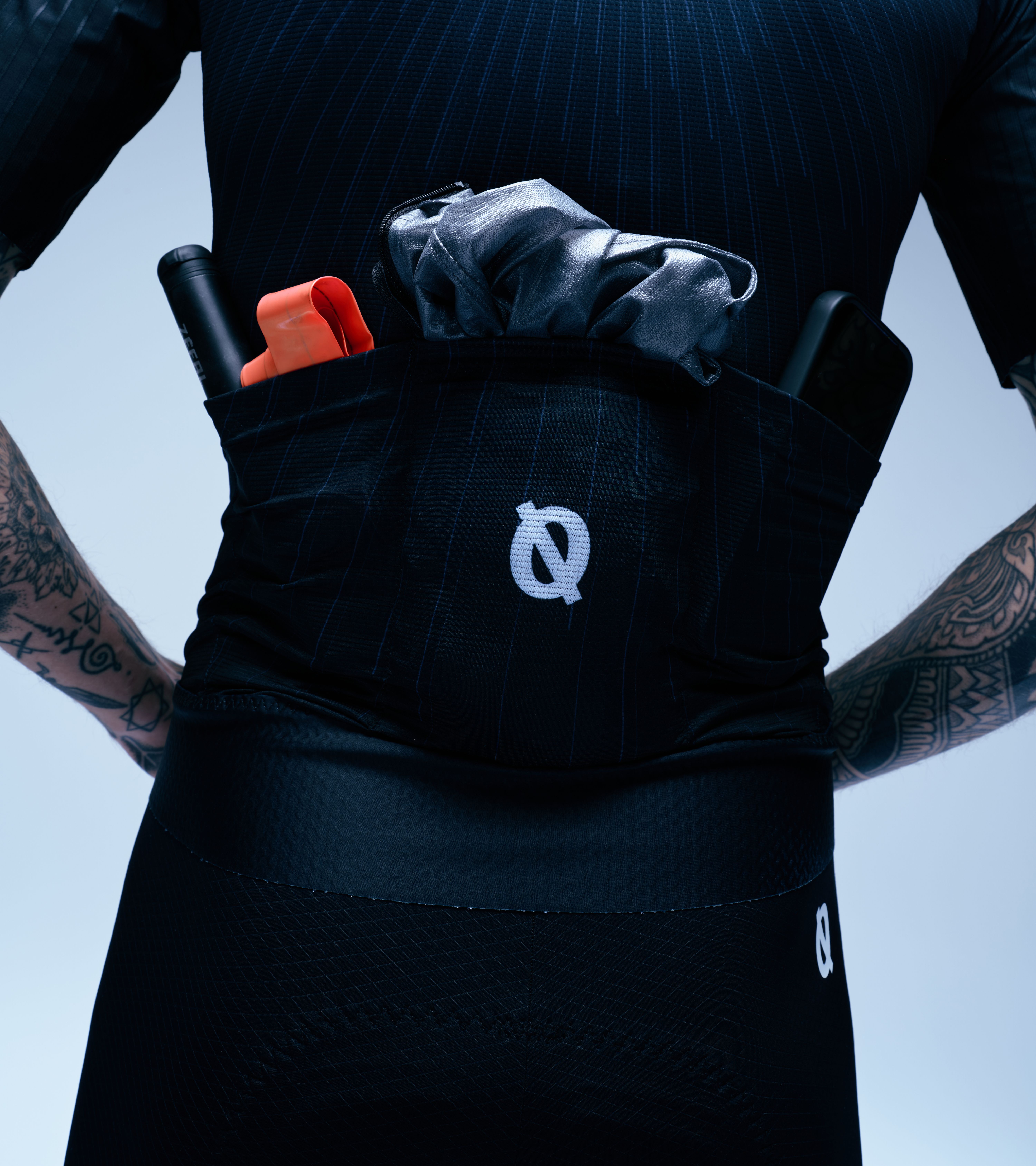
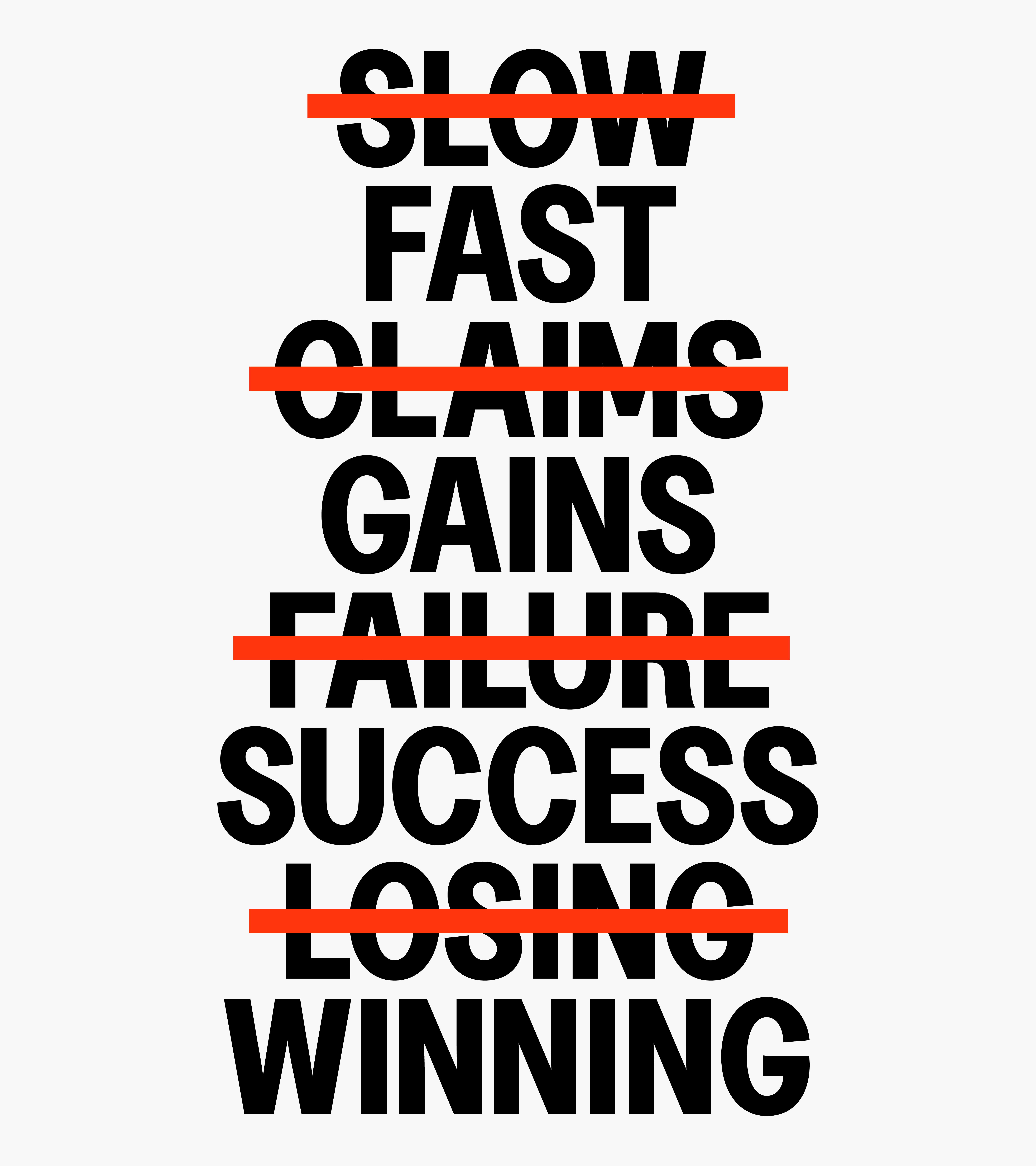
We leaned into the name itself. By defining what Nopinz is not, we established exactly what they stand for. This is a brand built to eliminate drag, both physically and visually. No pins, no fluff, just performance.
PLAY
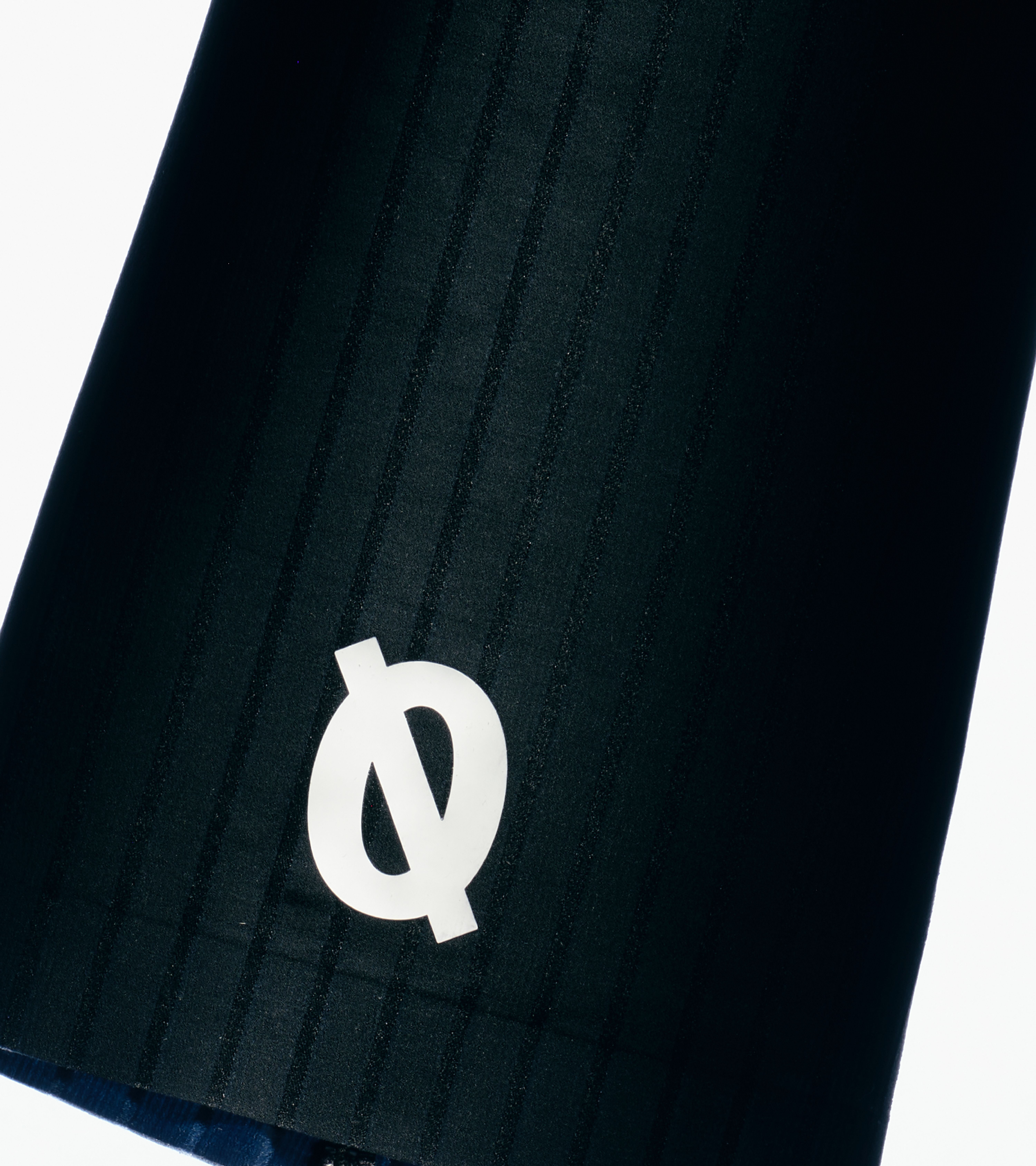
The visual identity is honed for speed. We used minimalist typography and a striking logo system to create a brand that feels aerodynamic. At the centre of it all is “Zone 5,” a signature colour that represents the threshold where lungs burn and limits are pushed. It is a bold, uncompromising look for a brand that lives at the edge of endurance.
“We wanted to create an identity that embodies the same uncompromising pursuit of speed that Nopinz athletes live by. No excess, no distractions – just pure performance. That said, our rebrand wasn’t built just for elite racers, it’s for anyone who values watts over wardrobe choices, but still demands the best in both.”
Will Cooper
Senior Designer, Studio Blackburn
Toggle
Nopinz
- Brand Strategy and Positioning
- Core Visual Identity System
- Verbal Identity
- Packaging Systems
- Art Direction
BRIEF
Nopinz is for competitive athletes who care about one thing: performance. We needed to differentiate them from the “fashion-first” cycling brands and reinforce their status as the go-to for pure, unadulterated speed.
WORK
We leaned into the name itself. By defining what Nopinz is not, we established exactly what they stand for. This is a brand built to eliminate drag, both physically and visually. No pins, no fluff, just performance.
PLAY
The visual identity is honed for speed. We used minimalist typography and a striking logo system to create a brand that feels aerodynamic. At the centre of it all is “Zone 5,” a signature colour that represents the threshold where lungs burn and limits are pushed. It is a bold, uncompromising look for a brand that lives at the edge of endurance.