
Frameworks
Brand Refresh
2025
SCOPE
Naming and Nomenclature
Visual Identity Systems
Bespoke Typography and Systems
Verbal Identity and Messaging
Digital Art Direction
Product and UX Strategy (Squarespace)
Toggle
BRIEF
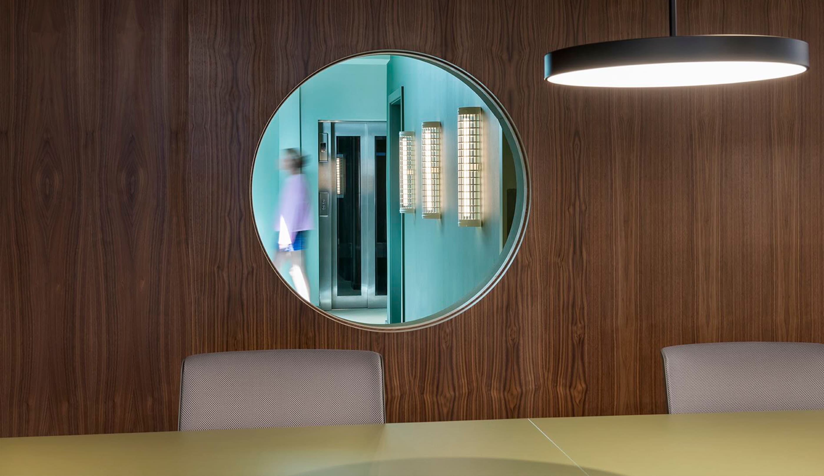
Frameworks provides architect-designed workspaces with an obsessive attention to detail. Founded in 2017, they have grown from a single site to a city-wide portfolio. We partnered with them to evolve their identity and position them as London’s most aspirational workspace provider, catering to clients from Mayfair to Shoreditch.
WORK
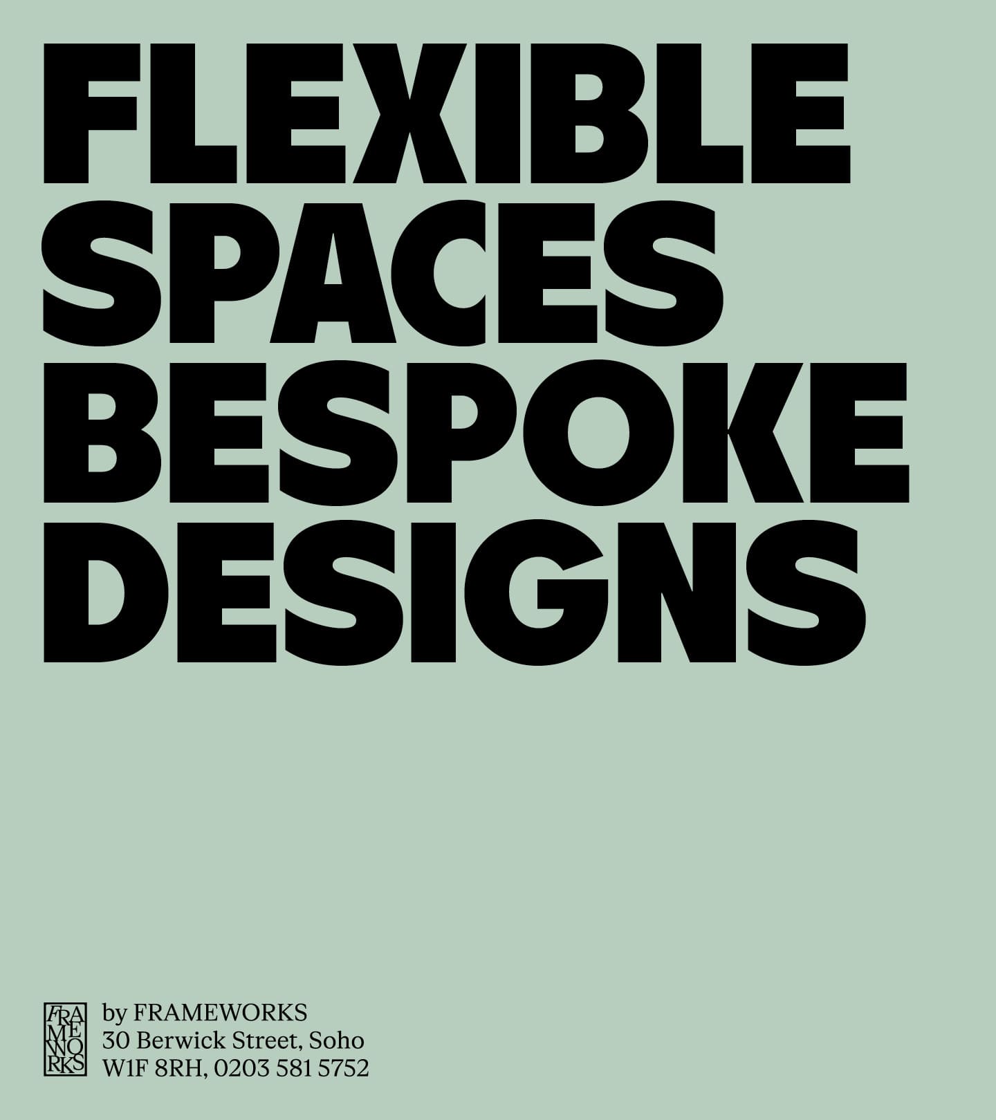
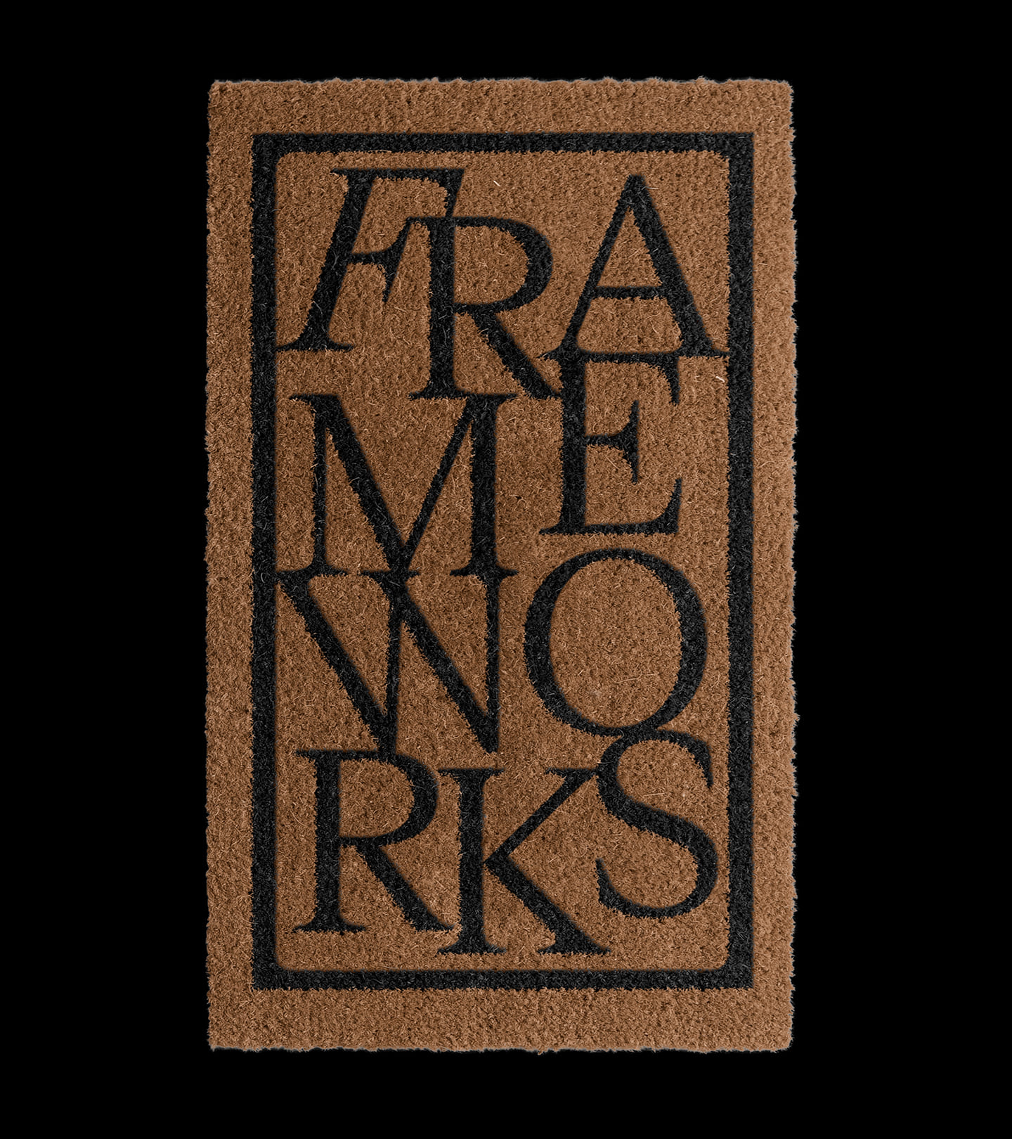
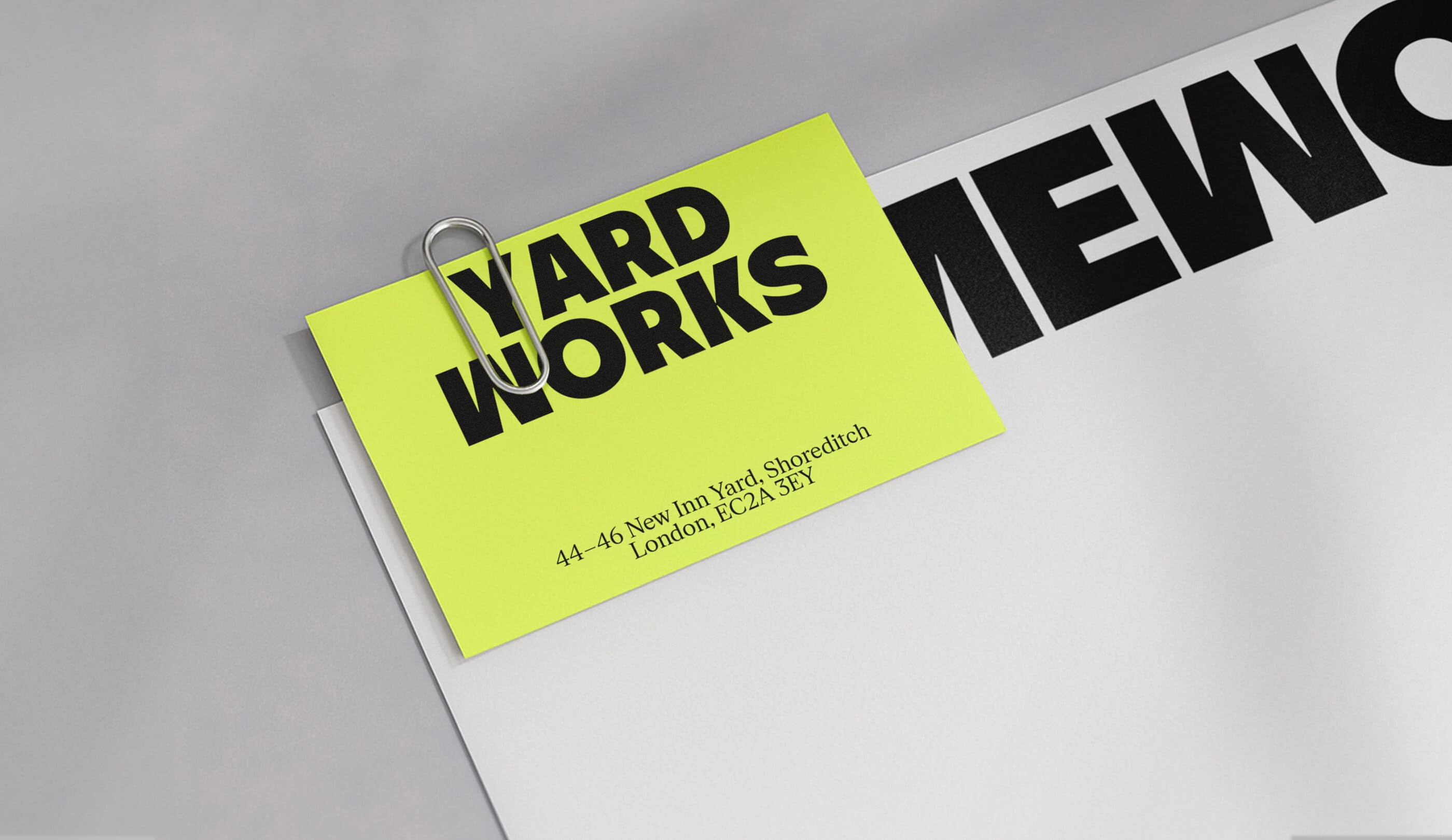
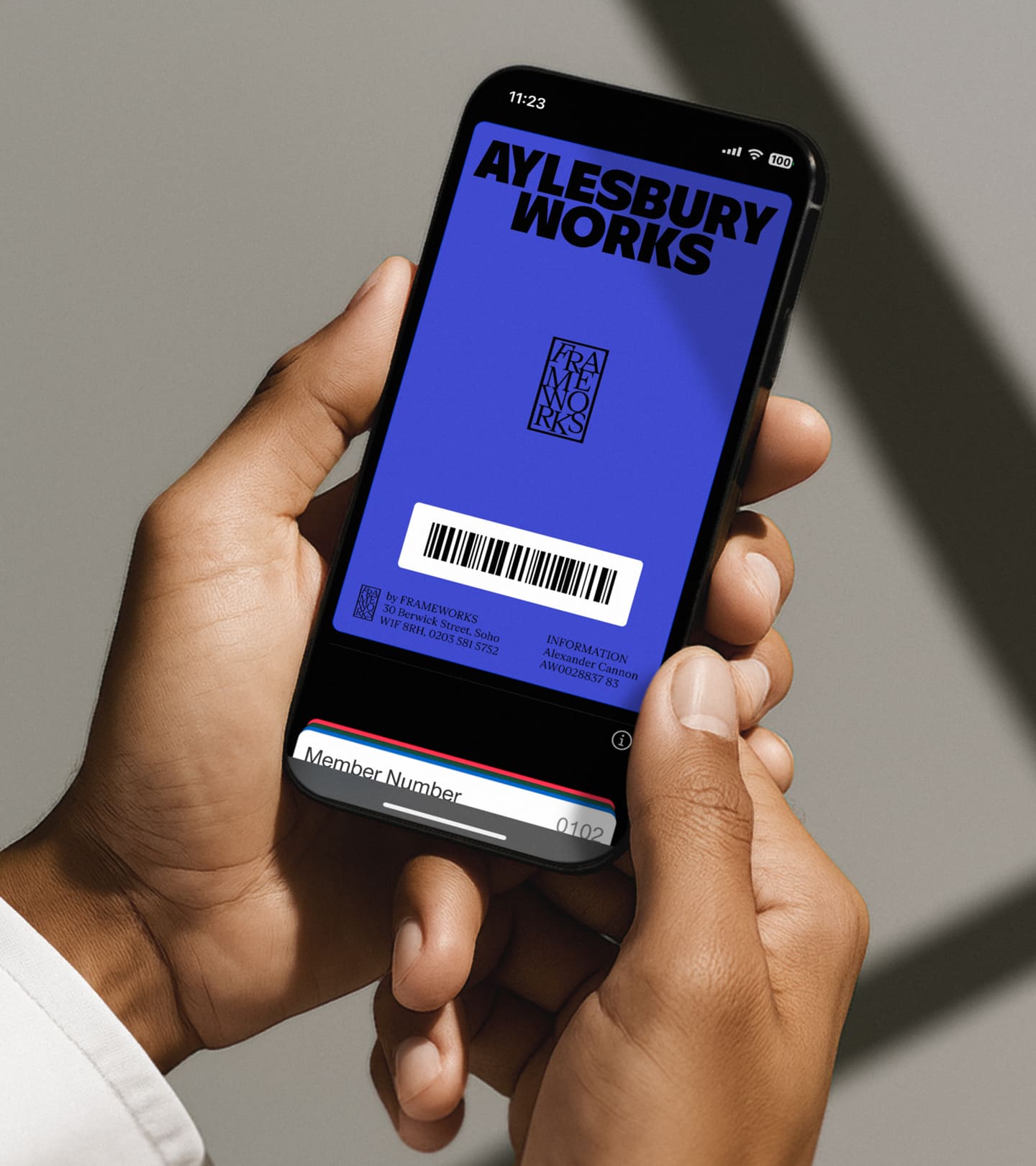
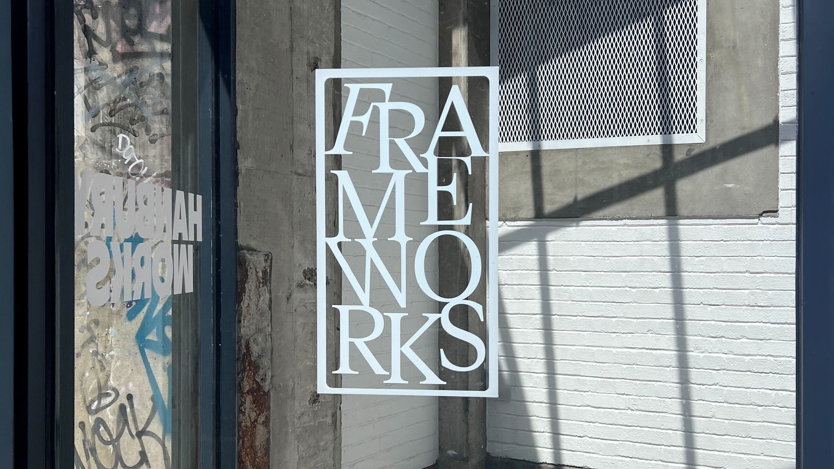
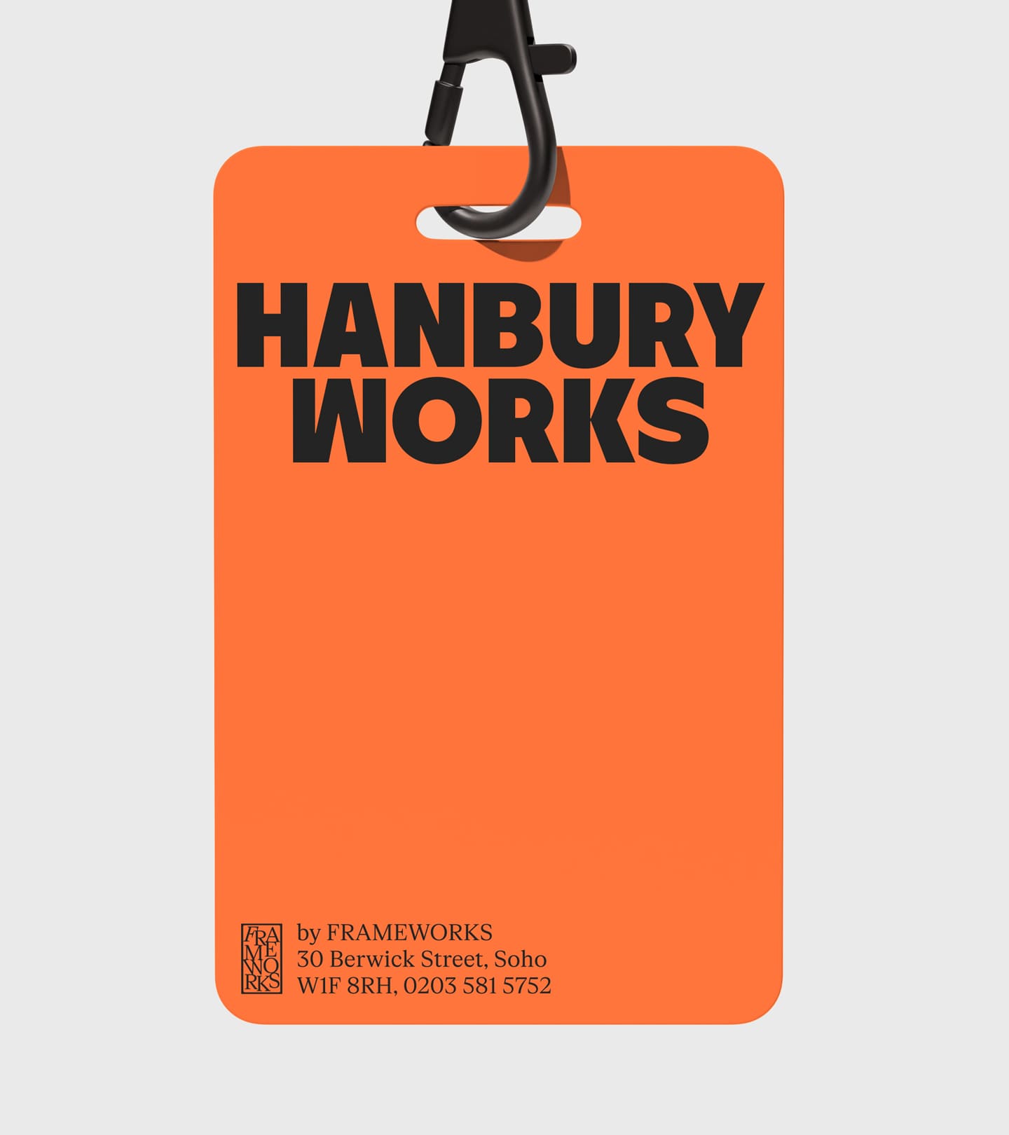
Most workspaces hide behind soft greys and muted tones. We decided to go the other way. To reflect their design-led approach, we developed a unique naming system for each location, ensuring the brand felt both connected and distinct across every site. We built a logic that allows the brand to grow with consistency and character.
PLAY
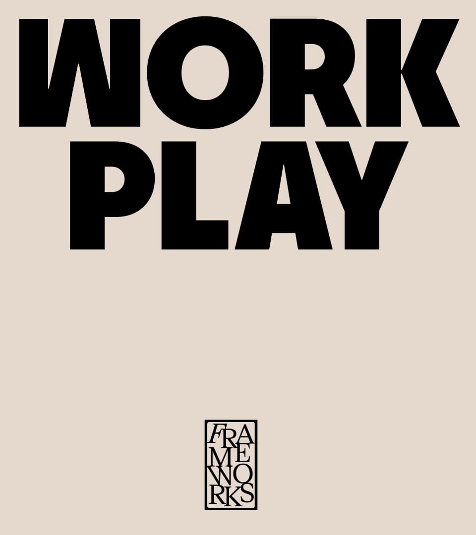
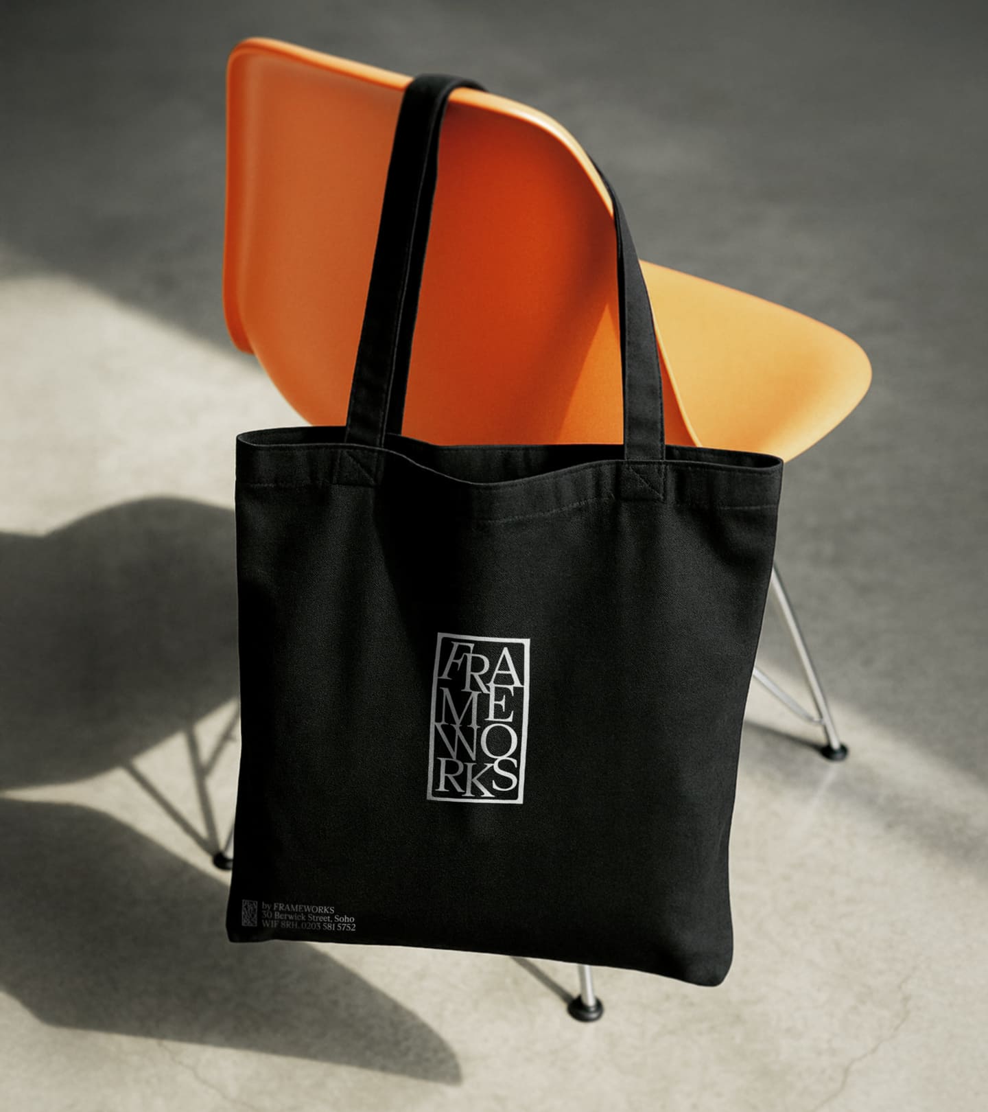
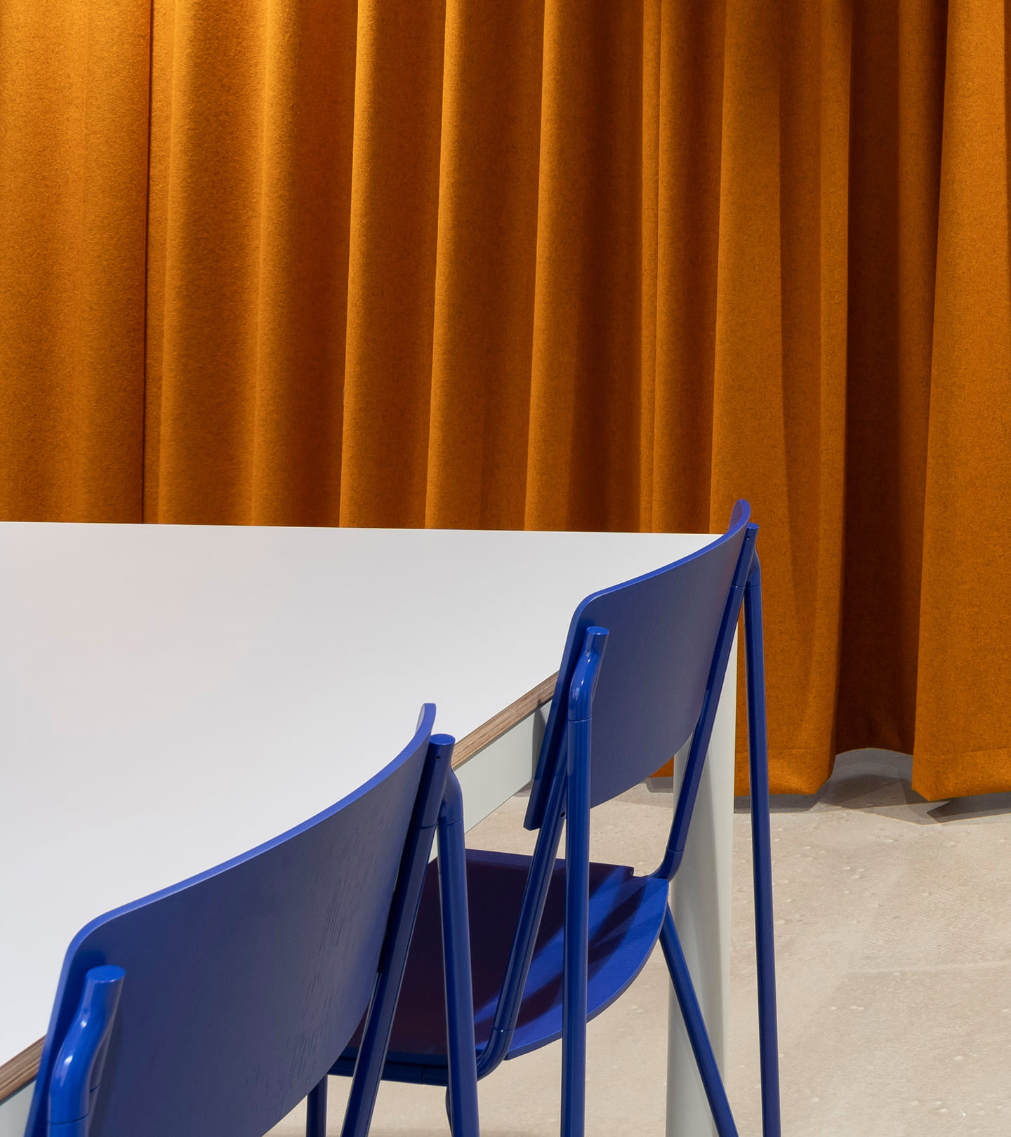
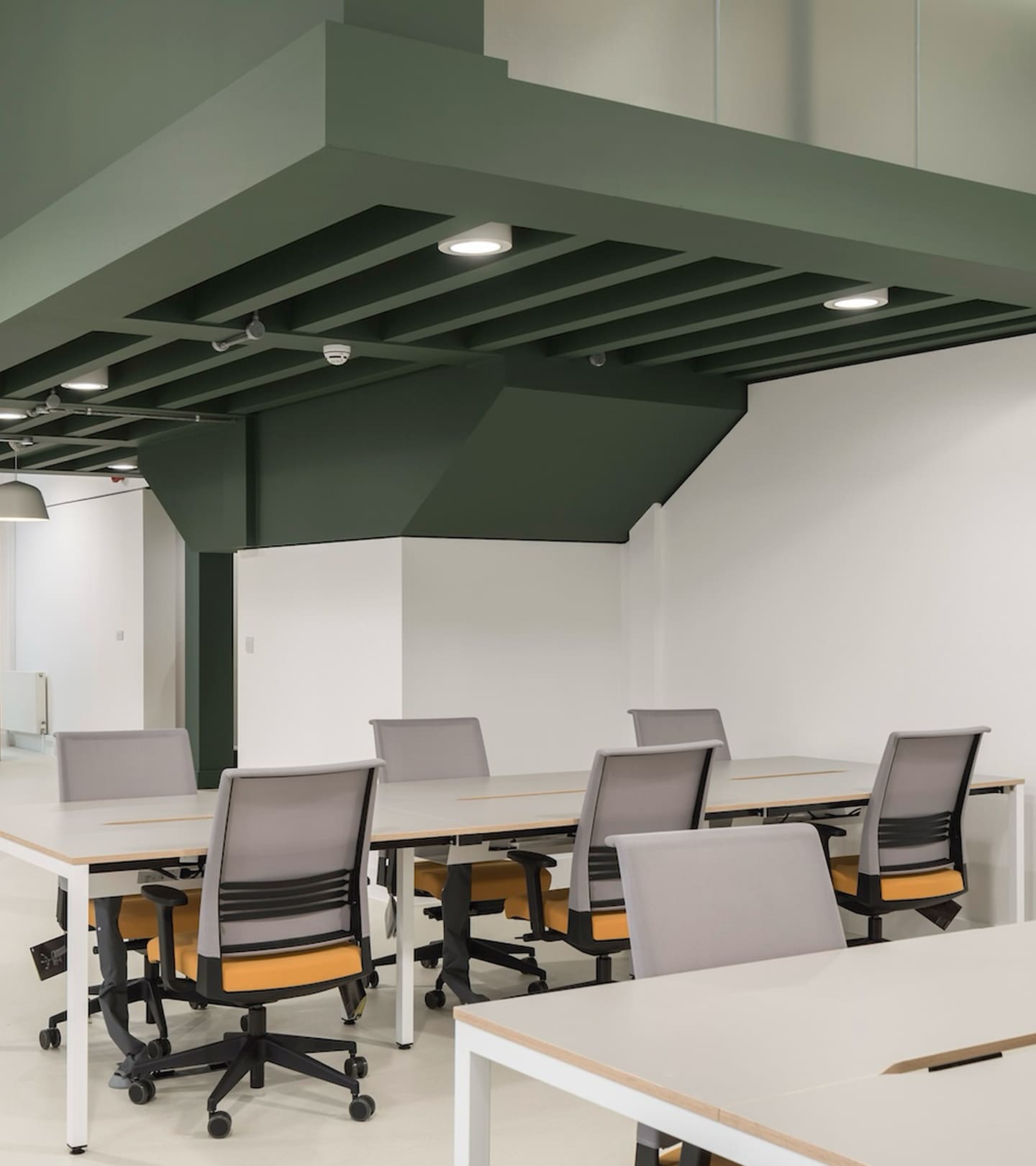
The visual identity finds a balance between grit and grace. We paired the bold RL Refusit typeface with the elegant FK Roman Standard and created a colour palette inspired by the specific architectural details of each building. We then brought this brand world to life digitally. By building the new site in Squarespace, we ensured the experience was high-performance and design-led while remaining agile and easy for the Frameworks team to manage.
“The process was inspiring, fun and surprisingly painless. The finished brand is a beautiful reflection of what we do at Frameworks.”
Samuel Roberts
Co-Founder at Frameworks
Toggle
Frameworks
- Naming and Nomenclature
- Visual Identity Systems
- Bespoke Typography and Systems
- Verbal Identity and Messaging
- Digital Art Direction
- Product and UX Strategy (Squarespace)
BRIEF
Frameworks provides architect-designed workspaces with an obsessive attention to detail. Founded in 2017, they have grown from a single site to a city-wide portfolio. We partnered with them to evolve their identity and position them as London’s most aspirational workspace provider, catering to clients from Mayfair to Shoreditch.
WORK
Most workspaces hide behind soft greys and muted tones. We decided to go the other way. To reflect their design-led approach, we developed a unique naming system for each location, ensuring the brand felt both connected and distinct across every site. We built a logic that allows the brand to grow with consistency and character.
PLAY
The visual identity finds a balance between grit and grace. We paired the bold RL Refusit typeface with the elegant FK Roman Standard and created a colour palette inspired by the specific architectural details of each building. We then brought this brand world to life digitally. By building the new site in Squarespace, we ensured the experience was high-performance and design-led while remaining agile and easy for the Frameworks team to manage.